 ... about rooms and decorators I like.
 The value of being a reader, even a collector, of interior design books is that one pretty quickly gets to know favorites - styles, furniture and decorators. Chester Jones is a favorite of mine and first knew of him when he authored Colefax and Fowler: The Best in Interior Decoration. Quite what was his work in that book is hard to say but I suspect it was the less English Traditional towards the end. I've learned over the years to appreciate his work from the pages of WOI, the magazine I have been collecting since 1983.
He is not the only decorator that interests me and as the title says this is the first in a series of rooms I like. There is a similarity to them all which is not to say they are all the same style but they share qualities dear to my design principles, style, and my sense of history. Not one of the rooms is a historical recreation, neither are any contemporary in the narrow sense of being infested with catalogue versions of mid-century or early modernist icons, nor do they veer towards the minimal: yet they do share a certain tailored quality, an appreciation of negative space, an aversion to neutrality - not talking about earth-tones and beiges here, as you will find them - and a liking of intellectual juxtaposition enriched by shape, color, texture and tone. All of them are places I could come home to but would not swap what I have for any of them.
 I love the way that the first photo shows the grid of the walls and its relation to the other objects on it and before it. Oddly enough it reminds me of the Swiss Grid System used in typography during the 1960s - a structure based on the Golden Section that enabled graphic designers to lay out a page in a proportionate way. That is precisely what is happening here - look at the way that the sofa seam lines up with the grid and the way that the four artworks on it relate to it yet float as if not bound by it and all the other objects, including the sofa relate to the grid either by reinforcing it or breaking it.
 To me one of the most exciting combinations in that room is the 1950s coffee table with the Regence chair - a delicatesse of curve and rectangle.
The grid continues into the dining room where the the dining table and armless chairs were made to live with what the Brits call "carvers", the dining chairs with arms. The sculpture on the sideboard is by Paolozzi and stands in front of a Scandinavian weave. In this room the grid serves as a quiet, soft waxed background.
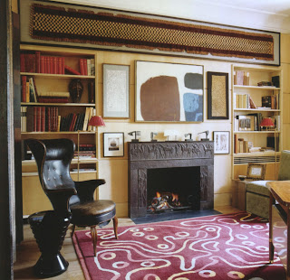
The room below, the study, has a combination of classically inspired fireplace, Kuba cloth, abstract painting and Fritz Henningsen armchair. All the art and objects throughout the place are museum quality from various cultures and times and each item is the best of its kind.
Despite, or because of, the quality of the objects, the overall design, the bespoke tailoring of it all, the place remains a haven of calm, comfort, quiet luxury, and of intellectual enjoyment.
These photos are from the April 2009 issue of WOI and the photography is by Simon Upton.


.JPG)


Putting words to the design is way over my head but keep them coming and I'll study. But - whether I understand or not - I think I'd be very comfortable in these rooms. Even with museum quality items, I wouldn't fear anything being too fussy or fragile.
ReplyDeleteThere is nothing more wonderful than an interesting room.
ReplyDeleteTerry, you're here to learn, so sit comfortably.
ReplyDeleteJanet, you're right and the most interesting room is the one we make our own.
Thank you both for your comments.