Friday, September 26, 2014

Baton Bob and Synonyms in Decoration


During a pre-theatre (Gilbert and Sullivan's HMS Pinafore) dinner recently, I watched eight identically-dressed young women walk by our table – long blonde hair, flimsy dresses and clumpy shoes – a look not improved by the effects of the late-summer storm they'd just arrived in. Obviously, I thought – as I munched on black rice, butternut squash, golden raisins, and cilantro with brazil nut pesto – no-one had noticed or maybe cared that the tipping point had been reached – the point beyond which fashion becomes uniform, and individuality apparent only in the unsuitability of the raiment for the figure, rather than in any other way.

I'm not so much of a believer in barroom psychology, but I did wonder that evening if group dynamics require such conformity of dress and, indeed, if group norms apply in interior design. It could be said that there is conformity in design judging by what is visible on Tumblr, Pinterest and blogs; but lacking any scientific data, I'll have to rely solely on my jaundiced eye.


Baton Bob, the figure in the two photographs above and a much-loved character (by me at least) in Atlanta, is often to be found strutting his stuff on Peachtree Road. His whistle is the first indication he is somewhere around, and I wish I could tell you how happy I was at seeing a bride shining in the shade by the side of the new mixed-use development, where only the day before the Celt and I had been stranded in a mosquito-infested, unfinished space without any means of exit (try explaining to 911 that the space where you are trapped is part of a complex called Buckhead, Atlanta that itself is located in Buckhead, Atlanta. Talk about a comedy of errors!) Without taking this sighting of Baton Bob too seriously, for me he represents the Individual, the Jester, if not the Fool of the Tarot, in a sea of conformity.


So, where am I going with this? I'd like to say I intend to post pictures of interiors that represent a certain individuality, but as I write I wonder, despite the wonders of Tumblr and Pinterest, if there might be a paucity of imagery suitable to my task. The English, mysteriously to me, are considered to be eccentric, if only in their decorating. What I have seen of spaces considered to be individual or eccentric is that frequently they resemble the attics of down-at-heel aristocratic hoarders or, worse, the rural digs of the Bloomsberries – in short, an accumulation of kit and effect that makes one itch to clear the lot out.


I've also been musing about an occasional series called Synonyms in Decoration – about interiors that are out of the ordinary, don't shriek of trend and are perhaps representative of an idea not immediately definable. In other words, rooms that are individual fantasies in a conforming world.


It seems such a good idea yet I might fall flat on my face. In the way that it's easy to come up with a good title for a book but writing a book is a "hoooolnuther thang" as they say around here. So, with my own little ignis fatuus, as it were, by my side I'll begin with the title Synonyms of Fantasy in Decoration and go from there. 


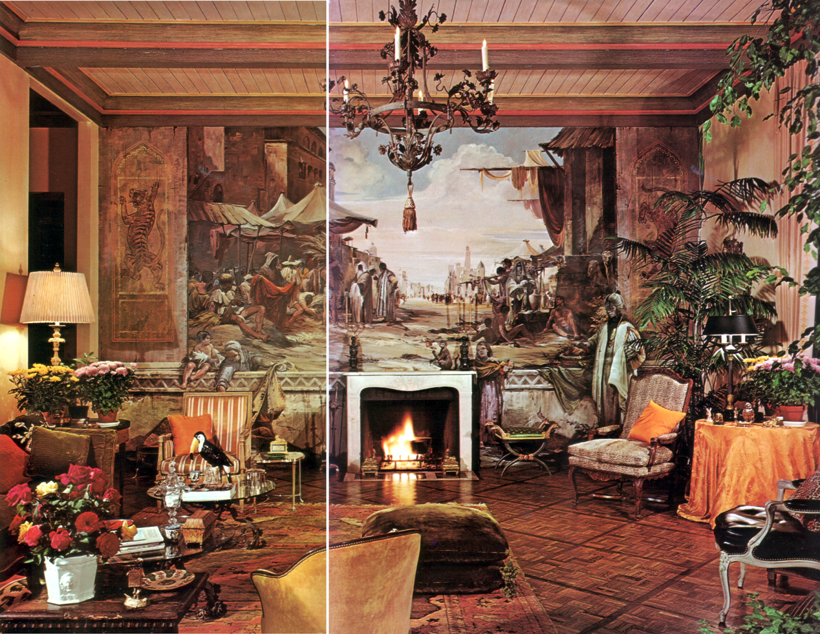
In these photographs the synonym for fantasy is the illusory depiction of an ancient Arab bazaar, drawn in a Renaissance manner with life-size human figures that seem both to attend and ignore the viewer – the whole, mural, decoration and architecture, suggestive of early twentieth-century American travels in Italy and Venice.  Now, fifty-three years after it was published, this house, from a richer period of decoration than we know today, to my eye has depth, subtlety and refinement that is rare.


Group dynamics, then, would suggest that fifty years ago this house was not untypical but I wonder why it never became legendary (not a description of a house I normally like but it is in someway synonymous with fantasy). I wonder if the tide for mural decoration had already turned. It was only ten years later that the whole rage for faux finishes broke out and real picture-making on walls became stranded in an historical alley. But, that is a post for a hooooolnuther day. 

The owner of the house and the decorator was William Chidester.
The architect was Walter Wilkman AIA

The muralist, and the painter of the picture above, was Douglas Riseborough about whom I find very little online that is satisfactory.

Photographs by Danforth-Tidmarsh, published in Architectural Digest, March-April 1971

Thursday, September 18, 2014

Again, on the brink

A few weeks ago I stood at a window on the brink of the ancient bed of the River Tay marveling at the quality of the long twilight that so late that summer's evening began to fade and, with the day, the river itself, far away in its present-day course, washed away in the oncoming night.


And so it is, the Celt and I, in our own union of Scotland and England wonder and worry as we stand at yet another brink – the possible dissolution of a Union  three hundred years old. Heartbreaking, if it happens.


A photograph I took in the Victoria and Albert Museum of a Putto holding the Crown and Coat of Arms of Scotland circa 1686. Marble, perhaps from a Roman Catholic Chapel in Whitehall Palace, and probably carved by Arnold Quellin, 1653-86 and Grinling Gibbons 1648-1721.

Update: Scotland remains in the Union.

Monday, September 15, 2014

In anticipation of a book

The photographs below are from a post I wrote about Geoffrey Bennison nearly five years ago. In the Topics list in the side bar I find I wrote about Mr Bennison ten times, making him one of my favorites. Were there any doubt that he should be one of the most esteemed decorators of the twentieth-century, the publication of this book early next year should leave no doubt at all. 


The author is Gillian Newberry and Sir John Richardson has written a Foreword. Of all the books in the publishing lists for the coming months this is the only one with any interest for me. Gillian Newberry who had worked as Bennison's assistant founded Bennison Fabrics together with her husband in 1985 after Geoffrey Bennison's death. 


Published forty years ago these rooms remain to my eye remarkably undated. Greenery in baskets, even a plant in the summer fireplace date the photographs to the 1970s. That era's equivalent of today's clump of white phalaenopsis, ferns, ficus, etc, always looked a little self-conscious, as well they might given their role as swank purchases from the newly-established fancy garden centres. They didn't last long of course, those tropical parvenues, for the decidedly chilly air of social decline soon saw them off, their places cleared for the amaranthine qualities of silk plants and flowers. Even silk as a designation in this context has declined, I fear, for now we must say permanent. As a nomenclature permanent can cover a multitude of sins – from what once may even have been silk at its genesis, to what might well be its very worrisome end, resin. 

And that brings me in a very roundabout way to the subject of my next post but one – something that has been worrying at me for a while. This link to one of my favorite websites will give you a clue. 


Photography by Derry Moore from Architectural Digest November/December 1976


The book will be published by Rizzoli on March 24th 2015 – a long time to wait, I know, but I'm like a kid waiting for Christmas morning.  

Wednesday, September 10, 2014

Good advice for shelving books from 1929, a return to a theme, a painter and a coda

Lunch with my old prof is a weekly pleasure and frequently by the time we leave the restaurant she's said "come in when you take me back, I've got things to show you." A small woman of strong education and deep culture who graduated from the University of Illinois the year I was born, whose house, as all repositories of long lives must be, is a reflection of her mind – its walls and shelves filled with books and pictures, its cupboards and drawers filled with accretions of half-forgotten, once-interesting things ready to be brought out when she thinks someone might have use or need. And so it was last Friday – not that I knew it at the time – when she loaned me two brochures about Robert Allerton Park at the University of Illinois – she handed me a hitherto unknown paragraph in my Connections series about gay men, decorators, their clients and friends, men long dead and whose work is now, in the scramble for attention amid ever-irrelevant history, almost completely forgotten. 


I had intended to write again about books because I'd found a downloadable copy of Harriet and Vetta Goldstein's excellent Art in Everyday Life where the two sisters (my old prof's mentors – she was their last graduate assistant before their retirement) gave good advice which I quote at the end of this post about how to arrange books on shelves. And so it was when I saw Robert Allerton's library in one of the booklets I thought it perfect, and perfect for my purposes – my all-too delayed return to my theme. (The fact that his sofas resemble mine exactly has nothing to do with it).

Allerton's main library above, one of three in the house, converted from the music room, was designed by John Gregg, the man with whom, after the stock market crash of 1929, Allerton was to spend the rest of his life. In fact, in 1959, after a change in Illinois law, Allerton adopted Gregg as his son. According to Wikipedia they were one of the most prominent same-sex couples of their time.

The "butternut" library, paneled in lumber cut on the farm, 
was considered by Robert Allerton as the "family" library

The stable, no longer needed after the gift of an automobile,
was converted into the "barn" library with a garage underneath

It might be that I am the only person left in this country who did not know about Robert Allerton and John Gregg but in case there is anyone else as ignorant as I of a moment of gay history I shall continue with a paragraph or two more. Assuming, that is, in a time when, arguably, homosexuality did not exist simply because no-one talked about it, two men living together as companions, with one eventually adopting the other, could lead one to believe there might just be something more than sharing expenses to their relationship.

Glyn Warren Philpot
Self-portrait 

 "The Man in Black"
Robert Allerton by Glyn Philpot

I am struggling with facts that might be already well-known to many but it comes as a surprise to me that Glyn Philpot first visited Robert Allerton in 1913 when he painted a portrait of Allerton for which the latter then declined to pay. The portrait, "The Man in Black" now hangs in the Tate Gallery. This portrait was one of Glyn Philpot's works that earned him the designation of RA at the young age of thirty. 

Clearly I need to find and read a biography of Philpot before I take this idea of connection much further - despite the fact that this artist recently has been on my mind. Philpot painted the murals that once accompanied this fireplace that I found, forlorn, in a Victoria and Albert Museum corridor this past July – though considering the fate of the murals I'm glad it was bought by the museum. But, that's a whole other post. 


So, back to where I began – with books and advice. It really is very good advice and if you think of the date, 1929, it is rooted in the Arts and Crafts Movement.

"So simple a thing as the arrangement of books will add to or detract from the beauty of a room. The very plainest books can make a beautiful effect in a room if they are grouped according to size and color. To do this so that the result may practical as well as beautiful, divide the books according to their subject-matter, and then within these groups arrange the colors and the light and dark books so that they will present the appearance of well balance groups rather than a light book here and there, an occasional dark one, and bright ones scattered all about. Keeping the lighter books near the top and around the center line, for well placed emphasis will help to complete an interesting color pattern.

"Books and magazines which are easily accessible will do more than anything else to make the living room seem home-like. Books are always more inviting if they are placed on open shelves instead of being shut off behind glass doors. They should be placed so they are convenient for use, and if there are interesting books and magazines on small tables in the room, in addition to the generous shelves, it will add immeasurably to the enjoyment of the room."


After all the discussion of vignetting, I thought you might like this. It's the tail end of a catalogue that dropped in the mailbox this week.


"The Man in Black" from the Tate Gallery
The Philpot self-portrait from Wikipedia
Philpot Murals from "London Interiors" John Cornforth, Aurum Press, 2000
Libraries photographs from brochure about Robert Allerton Park, published by the Univerity of Illinois. 1951

Monday, September 8, 2014

Rumored to be for sale

Asking  price: about $525 million
Link here, thanks to Ted


The last three photographs from here

Thursday, September 4, 2014

As twinkle is to the twig

I said at the end of last week that I had a little more to say about vignetting in decorating but wandering around in the world of Ms Jen Teal and her play-date buddies is exhausting, so hollowly gracious is it. Frankly, I can't be arsed (as my scientist sister-in-law in her finer moments would put it) with a group that coos about styled shelves and crushes on scented-candles, monogrammed sheets, napkin rings, wineglass charms, wine swirling husbands, and cosmetic propriety.


Yesterday I came across this page in the book Decorate Fearlessly: Using Whimsy, Confidence, and a Dash of Surprise to Create Deeply Personal Spaces. I photographed it because it seemed to me to sum up all that is wrong with decoration as is frequently portrayed in blogs and books – the room, the shelving unit especially, has been created for the camera alone. It is as meaningful as the decoration of a Christmas tree and as ephemeral and relevant as twinkle is to the twig. 

At the very least, a design for a room must have some basis – a conception that it will be used, not just gaped at. Decoration is not just about embellishment, whatever the proliferation of sub-Hicksian colors and graphic patterns might suggest. Neither is simulation innovation, however celebrated the source of "inspiration" or "homage" as we say nowadays. 


This is where a room begins, on paper with a pencil in hand, brain in gear and client requirements fully appreciated. It does not begin on the shelves of what once was book storage.


In conclusion, this note:

The profession of 'decorator' is is not legally defined. Here is what ASID states about decorators, and it's as barebones and self-serving a definition as one can get. 

A decorator works only with surface decoration – paint, fabric, furnishings, lighting and other materials. Because no license is required, upholsterers, housepainters, and other tradespeople also claim the title “decorator.

According to ASID, the difference between a decorator and an interior designer is as follows. 

Interior designers are professionally trained in space planning. In 18 states, they must pass a strict exam and be licensed. While both designers and decorators are concerned with aesthetics, style and mood, interior designers have comprehensive training and command skills that may include an understanding of:

flame spread ratings, smoke, toxicity and fire rating classifications and materials
space planning for public and private facilities
national, state and local building codes
standards regarding the needs of disabled or elderly persons and other special needs groups
ergonomics
lighting quality and quantity
acoustics and sound transmission


All images other than my own photograph and Mr Mark Hampton's floor plan* found on Tumblr sites. 
*Mark Hampton on Decorating