Tuesday, June 30, 2009

Once and future comeliness ...


... in a district of tidy villas.

"A cursory glance at East End farm reveals that its antique aspect is the result of studied care which keeps at bay all signs of disintegration while preserving the marks of age. There are many new bricks amongst the old; buttresses discreetly support bulging, leaning walls; art has had more of a hand than nature in the disposition of the creepers and mosses which accentuate the picturesque irregularity of the old building. It stands as a reminder of  former comeliness in a district of tidy villas. Built on a slope, it dates probably from the 16th century, a timber frame filled with rosy brick nogging, and roofed with tiles of a particular rosy red. The chimney stack is of exceptionally fine workmanship." 

English Cottages and Farmhouses, Olive Cook, photographs by Edwin Smith, 1954. 

Monday, June 29, 2009

On the occasion ...


... of my birthday let me say, sweetheart, you're my gift.

Painting, In Paris With You, Howard Hodgkin, after Chaim Soutine, my all-time favorite painter. 

Friday, June 26, 2009

End of a week ...


It's been a hell of a week and another one likely to follow so let me get straight to the point, dinner and a cocktail.

Tonight we'll go to Pricci, a favorite restaurant in Atlanta - sometimes you just need the security of old friends not the flash of new acquaintance - I'll probably order fettucini alfredo with extra nutmeg and my Celt will probably order a slab of flesh and we'll catch up over a cocktail that is likely to be a Manhattan for me and a Campari soda for him.  

Thus, the cocktail of the week isn't really a cocktail but more of a hot-weather drink that can/could/should/must be laced with a great slug of vodka and savored in the shade whilst the world buzzes, whines and tweets around you. 

From Forever Summer by Nigella Lawson, a Mint and Lime Cool Aid.

Enough limes (8, perhaps) to make a little more than one cup of juice
3/4 cup granulated sugar
Bunch fresh mint with, if you must, some sprigs for garnish
5 cups water
Ice

Zest the limes and simmer for about five minutes in a pan with 1 cup of water, the mint and the sugar. When cool, strain the mint flavored syrup into a pitcher, juice the limes and add to the pitcher with the rest of the water and some ice. This is the point at which you decide if you need vodka - how much is up to you, but remember that there are two things with which one should not be ungenerous: booze and the milk of human kindness. 

Have a good weekend. 

Thursday, June 25, 2009

Eleven years ago, a favorite


Today I continued the clear-out of my office and resource room and whilst disposing of magazines dating back to the 1970s I opened the September 1998 issue of Architectural Digest because I recognized a photo on the cover as belonging to an article written about one of my favorite designers from the 1990s - Terry Hunziker.  Mr. Hunziker is based in Seattle but works nationally and internationally. A few months ago apropos something else I thought of him, googled, and called his office asking if there was a website I could access. Apparently there was not. 

However, all that apart, I'm really pleasantly surprised to see how little in eleven years Mr. Hunziker's own flat in downtown Seattle had dated. Eleven years is a long time in interior design and little that is described as classic actually lives up to the name. Classic of one period is not the same classic as that of another - in fact the classic interior design of the 1980s screams loudly of big hair and shoulder pads as much as it does of chintz. Try that look today! 

In 1998, I was very impressed by this flat and I still am - it still works and I think that after all this time it can be described as classic though there isn't a stitch of damask or brocade to be seen.


What is to be seen in these photos is an exciting mix of materials, some of them industrial in origin:  paints, scrap metals and recycled glass; others showing the hand of the craftsman - hand-troweled plaster, high-gloss automotive paint, ancient lumberyard wood, polished concrete and leather.
 

One of the qualities I look for in a favorite space is tranquility and this flat has it. There's tranquility in the Northwest palette of color, greens, beiges, creams and other colors intrinsic to materials rather than applied. 

For me there is a poetry of line, form, texture and color in the combination of early 19th century Russian chairs and the contemporary form of the table they surround - a table made of oak and steel.  The mix is even more exciting with the addition of Chinese ceramics, contemporary American pottery, African stools, modern abstract art, Art deco chairs, a Modernist (50s) drinks trolley, and black and white photography.

Eleven years later it still works and that is the essence of classic. 

Wednesday, June 24, 2009

I said yesterday ...

... that there were no surviving Regency decorative schemes (in their entirety). Well, guess what? Here's one, though the curtains are replacements.

The saloon, Sezincote, Gloucestershire from The Regency Country House by John Martin Robinson. 

Described in the caption: "The bow window, the form of the curtains, the trompe l'oeil gilt trellised cove, and the large looking-glasses all survive from the original 1820s decoration, and make this a pure Regency interior."  No color is mentioned in this article other than gilt so the photo is to be enjoyed in all its grey loveliness. 

Draperies like these spawned many a bastard in the hands of inferior desecrators in the 1980s and, I guess, that will be another post soon. 

Tuesday, June 23, 2009

Color


Gribloch, a house in Stirlingshire designed by Basil Spence in the 1930s, is described by Alan Powers in The Twentieth Century House in Britain:

"Spence was skilled at bridging the gap between tradition and Modernism, as he demonstrated at Coventry Cathedral, which made his name in 1951 - the same year that Country life published Gribloch. 

" .... the shallow curve of the entrance front at Gribloch, terminating in a balconied bow window, with smooth, white-painted surfaces, was directly inspired by the Regency."


This post is about the color of the decoration of the house. Whereas the architecture might be a bridge between modernism and tradition the decoration of the inside, attributed to John Hill of Green and Abbott "leaders in Vogue Regency style."  

The staircase above and below was the centerpiece of the oval hall that had a cornice of shells and rope, and was furnished with shell chairs and a shell and rope patterned carpet in turquoise, pale blues and mauve.  The staircase itself was designed in Paris by Raymond Stubes but the wrought iron balustrade topped by an aluminum rail was made in Edinburgh. 

The color scheme of the drawing room, not shown, was a pale-blue ceiling, plum carpet and oyster walls.  The curtains, hand-painted, had a large-scale floral pattern of plum, lime green, pale blue and pink. 

By the 1930s, there were no surviving complete Regency decorative schemes - color had faded and been overlaid with smoke from coal, lamps and cigars, silks rotted at the windows and the fugitive dyes of the damasks on the walls were utterly flown. Regency colors, or those thought to be Regency colors, no doubt appeared pallid, much as did the Colonial colors popularized by Colonial Revival decorators in the US. 

We can all remember those colors beloved by our grandparents - Wedgwood Blue, Old Rose, Pale Gold, Eau de Nil, Sage Green, Oyster, Old Ivory, Cream, etc.  All good colors in their own right and which still have a honored place in decoration.  For those of us in the US, seek out an older or even a present-day Martin Senour Williamsburg paint brochure.  Eventually, it became possible through spectro-analysis and other techniques to finally view the colors as they had been - strong and saturated. 

Strong and saturated, in bold combinations and on a Regency scale, had to await the arrival in the 1950s of one of the all-time great colorists, David Hicks. 

Monday, June 22, 2009

Indeed!


Today's post on Habitually Chic has a photo of the room above but in a more recent incarnation. This photo from Living in Vogue, 1984, is of the saloon as decorated by the then tenant Charles Beresford-Clark. Seeing the modern version sent me to my pile of yet unwritten about favorite rooms and here this was, right there in the pile. 

Yellow was a theme color of the 80s and I am pleased to see how after 24 years this room holds up in style and decor. Beresford-Clark's intent apparently was to let the architecture speak for itself so he used the warmest of yellows to set off the fine ceiling and chimney piece, Suffolk rush matting on the floor, and unbleached calico (muslin) for the very grand 18th century style festoons and curtains. The central pouf, though that is too small a word for such a large object, is in fact a divan (boxspring) covered in ticking. The chintz, Colefax and Fowler's Old Rose with Fancy, I think, adds a note a note of soft country-side pattern in what is really a superb example of what John Fowler himself called " humble elegance." 

Elegant, indeed. 

Sunday, June 21, 2009

On the Summer Solstice ...


... dance the Moon and Venus together on a bank ...

"....  where the wild thyme blows,
Where oxlips and the nodding violet grows,
Quite over-canopied with luscious woodbine,
With sweet musk-roses and with eglantine."

– Oberon, King of the Fairies.

Illustration: Lamentations upon Limitations, Malus Domestica, verse i.

Saturday, June 20, 2009

Dr. Faustus ...


... comes home. 

At the moment the imp appears to destroy his life's work, rather than looking tragic, he simply looks bored. There's a lesson in that somewhere. 


Temporarily the drawing is parked where it might come to hang as part of the art wall, if that idea survives, or it might hang where it more properly belongs in the library below. It will have a lot to compete but to help in that battle for recognition the drawing will have to be re-matted and reframed. The present matt was made for the gallery hang as was the generic frame and though the frame is silverish it looks rusty. In fact, the existing combination of matt, frame color and drawing paper is too depressed for my taste - it needs pepping up with a good off-white matt, a polished silver frame and perhaps an off-black/grey stripe somewhere. 


The memo samples - Lee Jofa, Mulberry and Calvin Klein in tones bridging the darkest brown of the mohair velvet sofa and the buff of the paisley and the carpet - on the armchair in the living room are part of the ongoing redecoration of the whole flat. 

The kitchen and both bathrooms are done, the living room and library are in transition and the bedroom is next - after the vacation in England and Scotland and the Poliform long-low cabinet for the living room is delivered. There's always a lead time on to-the-trade orders but the Italian one is particularly long because the factory closes down for the month of August - how civilized.

Photos made by iPhone.

Friday, June 19, 2009

Staying in the garden ...


This afternoon, as I left the office the thermometer on my car registered an outside temperature of 108F and shortly after as I idled in the shade on Peachtree it dropped to 100F. Later in the evening we visited our friends Bill and Brian at their beautifully restored and decorated Mediterranean villa for what turned out to be a very chic if steamy cocktail party in the garden and by the pool. Should I have been wearing a jacket? Probably not, but so many men in the South do despite the temperature, and I lasted long enough outside to down a sip or two of shiraz, catch up with a former co-worker, and then headed for the cooled atrium and stayed there sitting over the air conditioning vent chatting away to a former student now working in Bill's design studio. 

The photo above have nothing to do with this evening except that it was obvious once I was home again it was the picture for Friday. Traquire, for that is the house that is portrayed in this photo from 1906, is in Scotland where, generally speaking, the temperature so near midsummer is unlikely ever to reach 100F. 

So, why this photo?

"There was a time, when men were kind
And their voices were soft
And their words were inviting
There was a time, when love was blind
And the world was a song
And the song was exciting
There was a time it all went wrong."

The photos this week are all from before the First World War and evoke, for me, a holding of the collective breath by a society overwhelmed at the end of the 19th century by the militarism of the Powers in Europe. They encapsulate the perfect summer of Empire before the battle fields of the Somme were brought to flower, the onslaught of 20th century nationalism, socialism, modernism, depression and finally the Shoah that pollutes the rivers of Europe with perpetual shame. 

This beautiful photograph by Frederick Evans conveys nothing except the romanticism that age was subject to - the water a mirror reflecting the ancient walls towering above the elder at the margins, pure, tranquil and indicating nothing of the reality: the odor of rotting vegetation, the stagnant polluted water, the farmyard, the whirr of the midges, the lowing of cattle, the screaming of the slaughtered pig, the noisome privy, the stinging of the nettles, the infestations of vermin and insects, the workhouse at the end of a long grafting life, and the cycle of the seasons turning like a celestial treadmill. 

So why this photo? Nostalgia pure and simple - a subjective reading of an image that cannot be analyzed in any way other than by what we bring to it. Is this wrong? Is a capacity, surely universal, for inhabiting in our imagination a moment in time frozen in silver compounds, wrong? Perhaps, but it cannot be denied. 

A cocktail from the endless summer of Empire - Pimms Cup

8 ounces Pimms
3 cups lemonade
Half an English cucumber, sliced
Half an orange, sliced
Half a lemon, sliced 
Small apple sliced
Small bunch mint
Handful strawberries 
And, if you have them, the bluest of blue borage flowers

Mix in a big pitcher with a handful of ice and it should serve six. 

Photo from Scottish Houses and Gardens: From the Archives of Country Life, Ian Gow.
Pimms recipe from Forever Summer, Nigella Lawson.

Thursday, June 18, 2009

There was a time ...


Photo from Lost Gardens of England: From the Archives of Country Life, Kathryn Bradley-Hole. 

Wednesday, June 17, 2009

Genius loci


"Be not afeard; the isle is full of noises,
Sounds, and sweet airs, that give delight and hurt not.
Sometimes a thousand twangling instruments
Will hum about mine ears; and sometimes voices
That, if I then had waked after long sleep,
Will make me sleep again, and then in dreaming,
The clouds methought would open, and show riches
Ready to drop upon me, that when I waked
I cried to dream again."

– Caliban
The Tempest, William Shakespeare 


Photo of Campse Ashe, Suffolk, 1903. From English Gardens in the Twentieth Century, by Tim Richardson. 

Tuesday, June 16, 2009

For a while ...


... just stop and look out of the window. 

Consult the genius of the place in all;
That tells the waters or to rise, or fall;
Or helps th'ambitious hill the heav'ns to scale,
Or scoops in circling theatres the vale; 
Calls in the country, catches opening glades, 
Joins willing woods, and varies shades from shades, 
Now breaks, or now directs, th'intending lines;
Paints as you plant, and, as you work, designs.

Alexander Pope on the Genius Loci.


For a while.

Monday, June 15, 2009

Another favorite ...


... from WoI. Photography by Vincent Knapp.

This exquisite room belongs to designer David Collins and to me is one of the most lovely rooms I've ever seen.  I realize that color choice is immensely personal and I like the whole tribe of blues, lavenders, lilacs - all the way over to the blue-greens like the Tiffany blue - so its a given that this room would catch my eye and I'm glad to say it goes beyond reaction to stimulus. This room is erudite but reticent, scholarly in its own way, conscious in its choices with nothing left to chance yet not so tightly controlled serendipity cannot play a role - some of the qualities I look for and this room has them in spades. 

The bedroom curtains are made of lavender and blue satin over white linen sheers, the two buttoned chairs are an elegant Egyptian revival, what appears to be the headboard is blue lacquer, the closet doors could also be lacquer but the palest of blue/grey whites matching the walls. The chest of drawers depicting Palladian architecture, by Fornasetti, smokes the ethereal color scheme with a touch of black, as does the artwork above it and the wood of the chairs and the foot board add a flash of warmth. 


The whole one-bedroomed London flat is wondrous in its luminosity. Rooms need surfaces on which light can dance and skitter: objects that, like the silver globe vase on the Fornasetti chest, seem to hold the light and glitter it back. The gold frame above the fireplace plays the same role as does the glass, the crystal, the metals, the marble and the mirror. 

In the second of the two views of the living room (above and below) the white lacquer panel inscribed with text written backwards and when viewed in a mirror it reads "I don't give a fuck what you think if I don't think you give a fuck."


The dining room floor, not visible in the article, is navy blue leather. How beautiful must that be? 

Saturday, June 13, 2009

The rain that falls on Peachtree


There's the promise of more rain today and it brings to mind a little known fact: Peachtree Street, and maybe even Peachtree Road where I live (same street different designation and there's a whole lot of Atlanta history involved in that name change) is a continental divide which means the rain that falls on Peachtree can flow in two directions - the the Pacific or to the Atlantic.

Sometimes you've got to look out of the window. 

Friday, June 12, 2009

A reminder ...

... that True Blood, the best, the most true-to-life love story of a telepathic Louisiana cocktail waitress and a hundred and seventy year old civil war veteran, now vampire, returns at the weekend accompanied by a shape-shifting barman, a brother whose brain is in his ... errm ... six pack abs, a cross-dressing, drug-dealing short-order cook, fang-hating religionists, an in-the-closet state politician, and many an everyday country charmer - this is what I love about life in the South!

True Blood is back! Who could not love this stuff? I mean, come on!

The only cocktail I can think of that might fit this Friday post is, and I really do hate to be tacky here, a Bloody Mary but I'm sure being as unapologetically reprobate as I you don't need a recipe.

Image via Queerty.

Thursday, June 11, 2009

Favorite room number four

It's about the light, obviously, and the floor looking like a lake of milk is so beautiful.  There's not much to obscure the passage of light but plenty to reflect, capture, dematerialize, refract and to play with it.  Nothing hides in shadow. 

Photography by Coppi Barbieri.
Room from WoI March 2002.

Wednesday, June 10, 2009

Covered up ...


...  with paint at a later date. 

This Martin Battersby mural was painted at Charters a house designed and built in the 1930s by the architects Adie Button and Partners a firm specialized in industrial buildings who were asked by the client Frank Parkinson, a manufacturer of electrical equipment, to design a country house.

The author of the book The Twentieth Century House In Britain, Alan Powers says:

"In planning Charters, they managed with some success to recreate a vision of a grand country house in the language of the Modern Movement, which raised questions about the compatibility of these concepts.  When Modernism viewed itself as dynamic and aysmmetrical, it contradicted Classical principles, but Le Corbusier's formula of architecture as "a skilful, exact and magnificent game of volumes assembled beneath the light" was applicable to the eighteenth-century ideal of the clear-cut solid of a pale-coloured house rising from a sea of green."

Nothing of Modernism is visible in the decoration and furnishings of this room. Again, Alan Powers:

"Internally ... Martin Battersby's mural betrays a greater confusion, introduced by the decorator, Mrs. G. R. Mount, to gratify the taste of Mrs. Parkinson."

The following paragraphs in which the writer introduces the name of Vogue Regency given by Osbert Lancaster to this "variation of Art Deco whose restraint made it popular in Britain," are worth the read, as is the rest of the book,  if you can get your hands on it. It is still published as far as I know.

The mural is sweetly dainty and probably the delicate theatricality cannot stand up to the vast plane of the wall. The colors of the scheme were cream, gold and terracotta and judging by the tonality of the photo it all seems etiolated and pallid.  

Clearly Mrs. Parkinson's taste, or at least she acquiesced in the taste of her decorator, ran to the baroque in one form or another. The curtains, clearly damask, share the etiolation of the mural and have valances that are totally underscaled, perhaps mercifully, for the drop of the fabric - they just cover the dead-light at the top of the windows. The ruched shades had a sorry revival in the 1980s and survive still in the outer reaches of the suburbs. 

I'm assuming the stageset-like draperies of the fireplace are either plaster or marble - at least let's hope they are - and the blackamoores standing to either side add another layer of theatricality and a gentility that is spurious. And that word, gentility, sums up the room for me. Though I like Martin Battersby's work, generally speaking,  I find this mural thin and wan.  The sofa is a version of the Knole sofa, said to be the first sofa and still to be seen at Knole, but looks corseted and the table stranded in the middle of the floor looks as if it might be ready to scurry away at any moment.  The room looks smothered in good taste. 
 
I began by liking this room enough to make it a favorite but on reflection I think I talked myself out of that.

Tuesday, June 9, 2009

Last Friday


I mentioned Ben Smith's exhibit at the Twenty21 Gallery in a post last week and Friday evening we went to the opening which was one of a number taking place as part of the First Thursday monthly event. 


Ben's show is a retrospective and is composed of two extremes - his exquisite drawings and his massive wood-cuts. I like drawings, small scale stuff that can be handled, taken off the wall to see how the graphite lays on the paper and ... well, just plain old savored and salivated over. When the mood takes me I draw in silverpoint on rough watercolor paper, but that's a whole other conversation.


An exception to my liking of drawings and small scale art is my love of wall-filling 18th and 19th century history painting - and that is a coming blog post.  Above is a large scale wood-cut of Orpheus by Ben Smith and the minute I met Orpheus I fell. For me this wood-cut has references to neo-classicism, of Henry Moore, of Graham Sutherland, even Cocteau. I have the exact place for it but, alas, not the agreement that would have it hanging in the library. 

Below, the artist, Benjamin Smith, a gentleman and a scholar.


What did I buy? See below. Ben considers it to be his best drawing and when I asked why he replied that he'd kept it for years. 


Dr. Faustus ... at the moment when the imp appears and begins to destroy his life's work. 

I saw this at the framer's, the wonderful Caroline Budd, and knew I had to have it. The propensity for wanting things is a diabolical impulse that is mostly if one is not to go bankrupt to be ignored. There are times when acting on that impulse pays off and my buying Dr. Faustus is one of them. This is the second Ben Smith drawing we now own - the other entitled Death Cautioning Mirth and I'm still thinking what that means.

Monday, June 8, 2009

Not satisfied ...

I'm trying to find a satisfactory chaise longue, daybed, fainting couch, chase lounge, recamier - call it what you will - for the living room. 

Undoubtedly, the best choice would be something like the one under Pauline Bonarparte, above: Empire, Roman in origin and made by the one of the best Ebénistes. However .... life and the wallet being what they are, I would settle for something equally well proportioned but perhaps with less reference to the Antique. 

Below are my choices so far - well, options more than choices. I'm not thrilled by any of them though I like the black and the wooden ones - third and second from the bottom - the others being so quotidian and, frankly, really rather boring.
 
Where to go from here? 

Any ideas? 

Suggestions? 


Our living room is undergoing a transformation from being the slightly fusty accretion of furniture to something more modern. When I say modern you will understand from the previous posts on favorite rooms that my taste runs to the classic (heck, Brooks Brothers is my ideal of one-stop-shopping and my shoes are made by Arden, so go figure) with a twist, but my partner's taste is much more adventurous. Whereas I am for classic grayed-down color, there isn't a strong bright color or quirky shape he doesn't like.

We've toyed with idea of the Barcelona daybed but both think the Barcelona coffee table is enough of 1920s Modernism for any room outside of a catalog. The Eileen Grey daybed above is from the 1920s but is less of a cliche and there are more beautiful pieces of sitting furniture by Eileen Grey that would fit better but would not offer reclining. 

Reclining is the point. I like to flop when I read but I also like to frequently change position and few of the options shown here allow that. Perhaps the sofa we have is after all the best choice for I can sprawl, one leg over the back and the other hooked over the front of the cushion. It ain't purty but its comfortable! 

The one above is my favorite so far. 


Sunday, June 7, 2009

Blue

Morning on our balcony.

Friday, June 5, 2009

Favorites ...

... this time by Veere Grenney, a New Zealander living and working in London. The first photo, again from WOI,  is a view of his light suffused drawing room overlooking the Thames.  The room is centered on the large velvet covered ottoman that interestingly does not preclude using a coffee table in front of the sofa. The two chairs between the ottoman and the windows are by Robsjohn Gibbings and they stand either side of a wonderful Regency table.  Min Hogg, writer of this article and former editor of WOI says ... 

"This apartment, says Veere, is a culmination of his life so far, the expression of his vision, his colours, love of textiles and and importantly as a background for his growing painting collection, in particular his oils and drawings by late British artist Roger Hilton.

The building overlooks the Thames and was constructed originally in the 1880s as a town house for the countess of Wemyss by architect Richard Norman Shaw. It occupies a double plot, and having been converted into flats in the 1920s, its river frontage is as wide as an lateral conversion. Veere has an enfilade of three spacious rooms bathed in the sparkle and glitter of light reflected off the water."

Here, in this vignette of the bedroom, stands Mr. Grenney's desk, a beautiful Louis XV style, apparently made in the 1950s by Jansen for Billy Baldwin. This desk and the white chair, fittingly beautiful to my eyes, are examples of the two streams of design that made the the 20th century so fascinating - the white chair's construction using the latest technology of the 1950s , though in its buttoned back references the 19th century, and the desk reproduces a style of 18th century France. It is that dichotomy between using what is current technology and the nostalgia inherent in looking to history for prototypes that is well illustrated here. 

In fact it what I am talking about is the battle of two giants, Modernism and Tradition, and that battle continues. Sometimes as here in this flat there is a truce: no longer the need to be a hard-line polemicist, if its beautiful and it fits, why not use it? 

In honor of Janet who posted a beautiful photo of gooseberries on her blog JCB, this weeks cocktail ...

Elderflower and Gooseberry Martini

1 tablespoon Elderflower cordial
6 gooseberries
2 ounces gin.

Muddle gooseberries in shaker, add cordial and gin, shake over ice and pour. Elderflower cordial is available at IKEA.

Thursday, June 4, 2009

Another favorite ...

... this time from the June 2008 edition of WOI. 

I don't normally like this kind of green/brown coloration - too autumnal perhaps - but this room meets the personal standards I set out in the previous post.  It is contemporary, tailored, spacious, sensual - almost purringly svelte.  The color palette is gratifyingly multi-tonal and I feel the room would look equally handsome photographed in black and white or in sepia.  I understand from the text that the designer chose 15 tones to use on the walls throughout the house - 15 out of a possible 250. In a world where one shade of white, or perhaps a "neutral" is the norm it is refreshing to see an such a cerebral response to color. This isn't the basic color theory! 

The rugs made by V'Soske and designed by Kay Hollar as was much of the furniture.  There are the present-day investment pieces, whether in terms of money, social standing or both: Robsjohn-Gibbings, Vladimir Kagan, Alvar Aalto.  The usual suspects you might say, but they work together beautifully with the artwork, the clean-lined large-scale upholstery and with the architecture. 

The photographer was Richard Powers. 

Wednesday, June 3, 2009

Favorites, the first of a series ...

... about rooms and decorators I like. 

The value of being a reader, even a collector, of interior design books is that one pretty quickly gets to know favorites - styles, furniture and decorators.  Chester Jones is a favorite of mine and first knew of him when he authored Colefax and Fowler: The Best in Interior Decoration. Quite what was his work in that book is hard to say but I suspect it was the less English Traditional towards the end.  I've learned over the years to appreciate his work from the pages of WOI, the magazine I have been collecting since 1983. 

He is not the only decorator that interests me and as the title says this is the first in a series of rooms I like. There is a similarity to them all which is not to say they are all the same style but they share qualities dear to my design principles, style, and my sense of history. Not one of the rooms is a historical recreation, neither are any contemporary in the narrow sense of being infested with catalogue versions of mid-century or early modernist icons, nor do they veer towards the minimal: yet they do share a certain tailored quality, an appreciation of negative space, an aversion to neutrality -  not talking about earth-tones and beiges here, as you will find them -  and a liking of intellectual juxtaposition enriched by shape, color, texture and tone.  All of them are places I could come home to but would not swap what I have for any of them. 

I love the way that the first photo shows the grid of the walls and its relation to the other objects on it and before it.  Oddly enough it reminds me of the Swiss Grid System used in typography during the 1960s - a structure based on the Golden Section that enabled graphic designers to lay out a page in a proportionate way. That is precisely what is happening here - look at the way that the sofa seam lines up with the grid and the way that the four artworks on it relate to it yet float as if not bound by it and all the other objects, including the sofa relate to the grid either by reinforcing it or breaking it. 

To me one of the most exciting combinations in that room is the 1950s coffee table with the Regence chair - a delicatesse of curve and rectangle.

The grid continues into the dining room where the the dining table and armless chairs were made to live with what the Brits call "carvers", the dining chairs with arms. The sculpture on the sideboard is by Paolozzi and stands in front of a Scandinavian weave. In this room the grid serves as a quiet, soft waxed background.

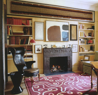
The room below, the study, has a combination of classically inspired fireplace, Kuba cloth, abstract painting and Fritz Henningsen armchair.  All the art and objects throughout the place are museum quality from various cultures and times and each item is the best of its kind. 

Despite, or because of, the quality of the objects, the overall design, the bespoke tailoring of it all, the place remains a haven of calm, comfort, quiet luxury, and of intellectual enjoyment. 

These photos are from the April 2009 issue of WOI and the photography is by Simon Upton.

Tuesday, June 2, 2009

Mrs. Gilbert Miller and ...

... the little boy in red, according to Mark Hampton in Legendary Decorators of the 20th Century.

"... for Mrs. Gilbert Miller, the famous Kitty Miller, who was eternally best dressed, very rich, a great, great hostess, and who conducted all of this busy, stylish life in rooms created for her by Billy Baldwin. Her apartment at 550 Park Avenue was enormous and pale and immaculate, exuding that instant sense of fantastic housekeeping which could be perceived the minute you stepped through the door. The big drawing room, which was really two rooms that had been thrown together by Billy, was renowned for the Goya portrait of the little boy in the red suit, which hung on the wall between the windows opposite the fireplace. For half of every year it hung at the Met. Mrs. Millers father, Jules Bache, had left it jointly to her and to the museum. As she grew older, it became annually more difficult for the Met to get the painting back. No wonder! The furniture was French and light in scale, covered in unobtrusive silks in soft tones. The curtains, equally light, were made of striped silk and, rather than having elaborate trims and valances, they were made in the simplest possible way, trimming with a self-stripe and hung from a very plain top molding covered in the same material as the curtains themselves."

Both photos from Billy Baldwin Remembers. 

Monday, June 1, 2009

Benjamin Smith Exhibition

An exhibition of Benjamin Smith's work entitled The Man Who Could Not Forget Mardi Gras  will open at The Twenty21 Collections/Gallery Rodin on Thursday June 4th. 

I have coveted Mr. Smith's drawings for a long time and I now own two - I feel proud to do so as the man draws like an angel, has the skills of a master and is possessed of a quirkily philosophical sense of humor that both entertains and intrigues. 

The gallery is located at 309 East Paces Ferry Road, Suite 110, Atlanta, GA 30305 and the opening reception beginning at 6 PM will last until 9 PM on the date mentioned above.  The exhibition continues through July.