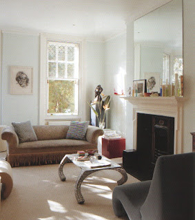
Searching through 1970s issues of Architectural Digest has proved to be both illuminating and suffocating. Let me explain.
It has been illuminating because I have seen good work by people I knew nothing of, people who developed even further during the following decade and beyond, in some cases. Enlightening also to see, in contrast to modern times, a fearsome use of color and texture and a mixture of styles of architecture and furniture. Not that a mix of styles was anything new in the 70s for the mix of modernism and historical style goes back to William Pahlmann at least.
Suffocating in the sense that there is a late 19th century aspect to 1970s decorating - much of it unquietly laden with bloated form, layered with strongly contrasting pattern, textured to extreme and claustrophobically colored.
Beyond this, two things strike me: one, the use of exotic plant forms in interiors and, two, there was an inward-looking quality to design with windows frequently obliterated under layers of shades and curtains. I'm sure there's significance to be found in these observations but I'm not going to bore you or me with any of that. After all, this blog is about interior design and not about reactions to societal changes of the time: Kent State, Watergate, the fall of Saigon, energy crisis, raging inflation, etc. The idea that interior design might be seen in a wider context with sociological significance? Just not going to go there.

So, I begin this week where I left off last - with Mr William Gaylord, a discovery if ever there was one. This house, situated on an acre of land, and strikingly different to his San Francisco apartment, was Gaylord's weekend retreat at Carmel - a wood and glass house hidden by trees on a street without street numbers, and to the designer's eye, at one with the trees.
Being at one with the trees, with nature, was the idea behind the use of plants in the house though to my eye, and here I do wonder if a photographer's assistant brought in more, there are too many. The plants simply get in the way, add visual clutter and destroy the clarity of what must have been a discriminating mix of style, material, and color fitted to the cool climate of Northern California. The author of the original article used the adjective eclectic suggesting a lack of discrimination on the part of the decorator.
It is not easy to judge these interiors for a variety of reasons: the rooms were not supply photographed; there's an emphasis on vignetting; angles are skewed, both by photographer and designer; views are marred by the planting; and, overall, there's a lot of clutter - something lacking in his city apartment - obscuring the forms of the furniture. It is not possible from these photos to get a clear impression of a whole room.
"Design should never be tricky. Something good lasts forever. For example, all that boldness of pattern on pattern can be exciting - at first. But it isn't something you can live with over the years."
"To me, the blending is what makes it all work. The total effect should be very smooth without individual pieces competing for attention. It's the same with color ... it should all flow together in one tone as a background. People should stand out, not colors."
The blend he talked about is certainly here: Chippendale chairs; a Regence chair; an Austrian birdcage filled with finches; Aubusson panels; Flemish tapestry; a Dufy painting; a Roualt watercolor; steel Napoleonic campaign daybed; a suede covered sofa; steel and glass coffee table; redwood walls; quarry tiles under Oriental rugs. It is the antithesis of the city apartment and maybe therein lies the aspect of retreat - a flight from the stage to the dressing room.
It's been an interesting trawl through the 1970s but I awoke this morning mawkishly thinking about my rakish youth spent in Greenwich Village, friends long gone, and .... well, enough already.
So, from the same year as these photos, and sung frequently on the way to work as a duet between Mr Stewart and me.
Wake up Maggie, I think I've got something to say to you
It's late September and I really should be back at school
I know I keep you amused
But I feel I'm being used
Oh Maggie, I couldn't have tried any more
You led me away from home
Just to save you from being alone
You stole my heart and that's what really hurts
Photographed by Charles Ashley for Architectural Digest, May/June 1972.


.JPG)


