Friday, April 25, 2014

How the light gets in, cellulite, Dr Johnson, and tired of life in Toad Hall

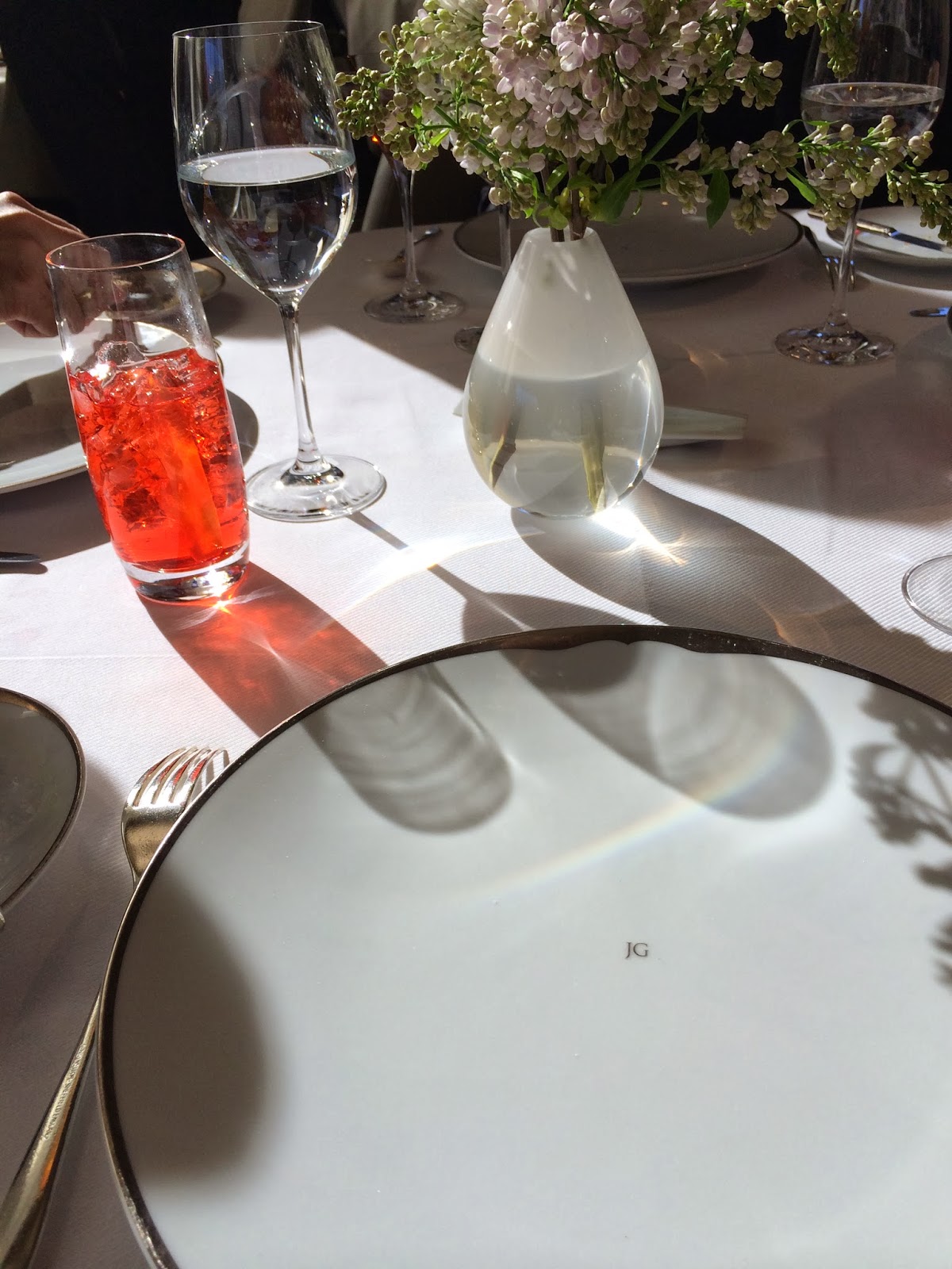
I'm not sure how he felt about four men pretending not to concentrate on his nose, but concentrate we did. "That's how the light gets in," said I, as the waiter, whose nose it was we were examining, walked away. "There's a crack in everything," said David. "Leonard Cohen," said the Celt. "Er ... what?" said Scott, concerned with checking us in on Facebook and still disbelieving what he had seen across the restaurant – the light from the window through a hole in the waiter's nostril. I went for a smeary flash of diamond but David, opposite me, had seen the truth, the light, as it were, at the end of the septum. "Shut it down ... I'm embarrassed." said Scott. Shut it down we didn't, but David and I looked suitably guilty and sipped our cocktails whilst the Celt and Scott wandered off into the hinterland of Facebook, scampering back when the theatre that is lunch under the elegantly etiolated chandelier really began.


Though that light was the adamantine light of winter sun, light it was and as thought-kindling and gladdening as the early summer light that irradiates where I sit this morning – the breakfast table (breakfast is finished and the table cleared) by the kitchen window on the east face of the building.

I seem to do a fair amount of woolgathering whilst at table, be it a breakfast, dining or cocktail table. Perhaps, in the case of the latter it's the bourbon that effects a certain introspection, but whatever the cause, for me, light and contemplation go together.


I did quite a bit of contemplating last evening as I sat in the murk known as atmosphere in the lounge of the Ritz Carlton where friends, always well-dressed, had texted whilst we were at dinner, asking us to join them for drinks. Blazers and khakis, I thought, could pass muster so we went. The best that could be said of the lighting as we walked into the lounge was that it was softly dramatic – or, if one were not so generous, dim and ineffective. Poor lighting in restaurants and hotel lounges is so commonplace as to be unremarkable though the older I get the more irritated I am by the casual ineptness of it. As the Celt chatted with our friends, I sat, sipped and stewed over the scene – constantly, streaming through the puddles of overhead light on the way to the restrooms, came the most badly dressed throng I have ever seen disgrace an elegant hotel lounge.

"...... when a man is tired of Buckhead," I thought, mangling Dr Johnson's famous quote about London, "he is tired of life; for there is in Buckhead all that life can afford." And whilst not untrue, it is perhaps ungenerous, but I do wonder when t-shirts tank tops, running-shorts, exposed cellulite, neck tattoos, flip-flops and baseball caps become acceptable wear even for a crowd that puts its gymshoe-clad feet on cocktail tables in hotel salons?

Not quite as if Toad Hall had been taken over by the ferrets, stoats and weasels from the Wild Wood but shocking, nonetheless. I have little illumination to shed on the phenomenon but perhaps the Great God Pan could remove my memories "lest the awful remembrance should remain and grow, and overshadow mirth and pleasure!"

"Shut it down ... Transit umbra, lux permeant" 
Thursday, April 17, 2014

A fine room

It occurred to me this weekend as I looked again at The Finest Rooms by America's Great Decorators as I tidied away piles of books littering the place (a sisyphean task, if ever there was one) that I have my favorite rooms and that to me they are very fine rooms indeed. None perhaps with the grandeur of those illustrated in The Finest Rooms but all with four things in common: space, simplicity, suitability, and atmosphere.

As I look around me now it seems again I'm still surrounded by books. On the coffee table, the weekends essential reading in order of stacking: Les réussites de la décoration française 1950 - 1960; Maureen Footer's brilliant George Stacey and the Creation of American Chic; an Italian easy-reader mystery La casa sulla scogliera; Mary Gilliatt's A House in the Country: the Second Home from Cottages to Castles; David Hicks's Living with Design; Mario Praz's Interior Decoration; and Brian J McCarthy's beautiful Luminous Interiors. As to the side tables .... well, I had probably better stop right there and return to my actual theme which is a new and not infrequent series about rooms I consider to be particularly fine. 

I have written about some of these rooms before and feel it will do no harm to give them another look. The rooms by Kalef Alaton, for example, still figure large in my mind as some of the finest of 20th-century decorating, as also do rooms by Antony Childs, Arthur Smith and Roderick Cameron. Rooms in palaces or rooms overflowing with preciousness probably won't get a mention but I could change my mind given I've just remembered a room in a Japanese palace filled with preciousness of a different kind.


The first in the series, then, are two photographs I found on Tumblr. A greenhouse, a pavilion, a bedroom, a retreat – it's all of these but to me, romantic that I am, it's the finest bedroom in the world. I can imagine nothing finer than to be in this room – presupposing a hundred acres of privacy surround it – when fireflies flicker and starlight gleams; when birds sing and sun rises; when snow falls or rain pours; when the northern lights stream, or nights, most magical of all, when the Milky Way shines across the sky.  The screams of massacred animals, the shrill of insects and the slither of snakes? Meh. As I say, I'm a romantic.


Friday, April 11, 2014

New neighbors

Ducklings as yellow as the pollen that blankets everything in Atlanta in Spring. 

Monday, April 7, 2014

Joseph Braswell

Of all my acquaintance, I know only one person who has houseplants. I'm not talking about white phalaenopsis – though perhaps I should be, given their omnipresence – rather about large plants like palms and figs used as decoration in interiors. They come and go, as it were, and last year, seemingly, the plant to have was the fiddle-leaved fig. Not, I think, as living sculpture as they might have been in 1960s modernist interiors, but more as an addition to the stylish bric-a-brac that today is dignified under the name of accessories. This isn't a rant against house plants for I don't care about them one way or the other – I like the occasional visit by a geranium but that's about it – but because I've been looking through 1970s magazines again I have noticed how they were used as foreground in photographs. Never seen nowadays, this peering through foliage (see the first photograph below and the lilies in the first photograph of the library) but so popular was this conceit in the 1970s it appeared even in the hand-drawn renderings of the time. 

I don't want to overstate this but, to my eye, large plants and their location both in a room and in relationship to the camera lens help date a room – much as white phalaenopsis date rooms to the first decade and a half of this century and, perhaps, fiddle-leaved figs will date rooms to the second decade. 

Not that these rooms at 740 Park Avenue, the erstwhile home of "international tastemaker Mrs Byron C Foy," decorated anew by Joseph Braswell for Mr and Mrs Homer Langdon, are dated; they all, including the library, have stood the test of time. The drawing room with its ivory, cream and yellow scheme, FFF (Fine French Furniture), could have been decorated recently, and the library, with its grey flannel and stainless steel, a superbly beautiful room, could well have been put together a decade later in France and only need refreshing today. 

Foyer
White marble floor, Louis XVI-style friezes, marble-topped console, 
eighteenth-century Coromandel screen hidden behind potted palm.


Drawing Room
Régence boiserie,18th-century Aubusson, yellow and cream striped sofas,
buttercup-yellow Louis XV chairs,  Régence-style ivory moiré armless sofas. Régence marble mantel, parquet-de-Versailles floors.

Drawing Room
"The walls were scraped and restored to the original woodwork, then finished with an eighteenth-century type water paint. Moreover, all the baseboards are the original marbleized wood." 


The Library
Matching bibliothèques flank the door, and a Flemish chandelier hangs above gray flannel sofa. Separated by a table supporting a treasured collection of Italian marble obelisks, a matching sofa faces the color television hidden behind a bank of false book bindings. 


The Library
In contrast with the oft-reiterated bronze and brass in the rest of the apartment, Joseph Braswell used stainless steel as the accent metal. The wall covering is a rusty-brown suede-cloth. The Italian marble fireplace is mounted on a sheet of stainless steel, stretching from floor to ceiling. 


Dining Room
Walls of aubergine cotton twill, red and gold Brunschwig & Fils water-taffeta curtains, 
silver and brass Louis XVI chandelier above 19th-century Directoire dining table


Daughter's Bedroom
Lit à la Polonaise draped in Colefax and Fowler's Berkeley Sprig


Master Bedroom

Joseph Braswell, despite being able with equal ease to step between residential and contract design, bringing to both the same erudition, color sense, and accord between style and purpose, was – as these photographs attest – one of the most underrated designers of the twentieth century. Click here for more about him. Braswell's design of the Helena Rubinstein corporate offices first caught my eye and it remains the supreme example of his work.


Photographs by Norman McGrath to accompany unattributed text (whence quotations) for Architectural Digest, March/April 1974.

Update
Two photographs illustrating my point about peering through foliage. Both are by Jeremiah O Bragstad and are from an article entitled In San Francisco: International Design Show in the same issue of Architectural Digest as above.

By Billy Gaylord

By Larry Peabody