It took three years to finally admit to each other that neither of us liked our sofa but, one Sunday recently, the Celt broke the early morning silence with the statement that he wanted rid of the dark brown mohair and, further, an option would to get rid of the sofa altogether. Not being able to face yet more forays into the showrooms looking for frames, the sofa is now in the workroom being recovered in a camel-colored wool from Kravet - a stuff with much the same hand as the camel sports coat or overcoat that used to be in each man's wardrobe.
One thing leads to another, of course, and since they were installed three years ago, I have grown increasingly dissatisfied with the blue silk taffeta curtains, pretty and delicate as they are, and I am looking for a replacement - drape in haste, repent at leisure, as it were. Below you can see the three fabrics I'm considering.

Lee Jofa's silk, white, pale grey, and lilac-blue, slubby, weighty and a real ikat, not printed, is fascinating and I'm having a real problem deciding against it. I fear it will take the room in a direction I'd rather it not go by making it a bit too haughty - and it's a lot of grandeur for a room to live up to.
The linen and polyester sheer has just about the right weight to filter light and will add a subtly-patterned verticality to windows broader, at fourteen feet by just over nine feet, than they are tall, but give absolutely no insulation against cold (as would the silk ikat if lined and interlined). Sheers unbracketed with curtains seem unsatisfactory to me yet we live in a 1960s brutalist modern building and the rooms are unencumbered by crown moldings and elaborate millwork. I wonder if sheers alone without the visual complication of over-curtains might give the room a more contemporary feel.
The third fabric from Lee Jofa, a heavy-weight linen, almost a smooth burlap, is a piece of nostalgia: its handblocked feel takes me right back to my years at college when I learned and enjoyed all kinds of printing from lino cuts, wood cuts, wood engraving, even letterpress, to lithography on stone. I love the texture of the ink and how it interacts with the surface on which it lies, and so it is with this linen with its crusty application of pigment. The design, by Peggy Angus, decidedly of yesteryear, will lend a home-spun, if spurious, Englishness to the room and take it down a notch or two.

Peggy Angus, who died almost twenty years ago, was of the same generation as Eric Revilious, Edward Bawden, Henry Moore and Barbara Hepworth. I first read about her in the World of Interiors a decade ago, though, looking back now, seeing her work then came as no surprise to me - I must have been conscious of her work during my years in design school. Her obituary in The Independent, a quotation from which follows, will tell you all you need to know about her, her work, and her place in twentieth-century decorative arts.
"In 1960 she won the Sanderson centenary competition for wallpaper design and her patterns were use by Cole and by Sanderson. But she designed few machine prints, preferring the less predictable effects of hand-printing, using small lino blocks and household emulsion. [latex paint]
"These labour-intensive wallpapers made her belief in creative patronage manifest. Clients were encouraged to have blocks specially cut and to participate in their design. The beauty of her handblock papers has been recognised above all by artists; partly because unlike most wallpapers they form the ideal background to paintings. Over the years Angus invented an extraordinary range of patterns. Many were abstract but others convey a vivid pastoral mood, making subtle use of oak leaves, heraldic dogs and birds, grapes and vines, corn stooks, stylised suns and winds. They seem rooted in the natural world and in the visual arts of the British Isles, from the Celtic pattern to heraldry to the art of bargees and gypsies."


Peggy Angus in her Camden living room (the house now demolished). Note wallpaper and tiled fireplace surround.

Peggy Angus also has two pictures, done in the 1930s, in the National Portrait Gallery, London: Ramsay MacDonald with members of his family and John Piper. Piper, a friend of Angus, interestingly, is seated in Alvar Aalto's Model No.31 chair - the first chair to cantilever laminated wood in its structure - before what could be his own painting Forms on Dark Blue.

John Piper, from whom Queen Elizabeth commissioned a set of views of Windsor Castle after seeing his work in the Recording Britain project at the National Gallery in 1941, also recorded the bombed fourteenth-century Cathedral of St Michael at Coventry the day after the bombing and went on, twenty years later, to design the glorious Baptistry windows of the mid-twentieth-century cathedral.


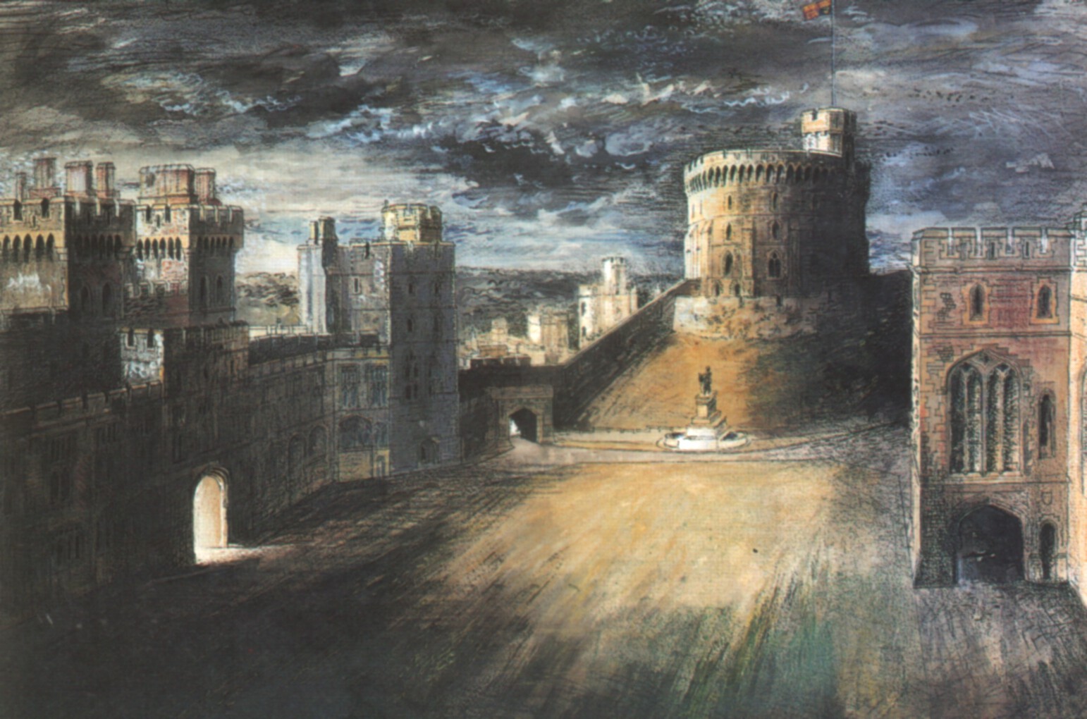
Piper's watercolors of the wartime Windsor Castle hung during the Queen Mother's lifetime in the Lancaster Room at Clarence House which is a far cry from Furlongs, Peggy Angus' rented cottage which had no hot water, indoor sanitation or electricity and to which Eric Ravilious paid tribute when he wrote:

"I was glad you liked my new pictures. The Furlongs period is more or less responsible for all of them, as I never could paint the Essex scene with much enjoyment. Furlongs altered my whole outlook and way of painting. I think because the colour of the landscape was so lovely and the design so beautifully obvious (only because Essex is walking country to me, and a place to play ball games) that I simply had to abandon my tinted drawings: and high time too. It was very clever of you to find a place like that and I shall always be grateful to you for the excitement it gave me."

When I began this post, I was concerned, ostensibly, only with thinking out loud the process of redoing the living room but when I wrote of the Peggy Angus linen that it "will lend a home-spun, if spurious, Englishness to the room" I knew I was still concerned with a theme I had begun last week in my post about Arthur E Smith - a sense of place. I shall likely ramble back to it.
Photo of Peggy Angus from The World of Interiors, September 2002.
Blithfield and Co's Peggy Angus textiles available at Lee Jofa.
Second and third patterns from Fabric and Papers.
John Piper's Coventry Cathedral from here.
Photo (© The Royal Collection) of the Lancaster Room at Clarence house from Queen Elizabeth the Queen Mother at Clarence House, Michael Joseph Ltd., 1996.
Image of Furlongs (© Estate Eric Ravilious) from The England of Eric Ravilious, Freda Constable with Sue Simon, Lund Humphries, 1982
The blue streak to the left of the image of the printed linen is thanks to my twelve-year-old scanner. I really should get a new one but like much which is old and cranky it still works, if only after a fashion, and looks better on my desk than it would in a landfill.


.JPG)


Haughty it up; the ikat is sublime!
ReplyDeleteandrew, thank you. As I said, I'm finding it very difficult to say no to the ikat. This weekend is the time to decide.
DeleteThis post is filled with very interesting material throughout. Oh, that stained glass!
ReplyDeleteI like the softened lozenge formed fabric in your selection. How delightful to redo your decoration in the Spring!
gésbi, thank you. I last saw that baptistry window in 1962 and I'm thinking of visiting Coventry Cathedral again either this summer or early December.
DeleteI wish you could handle the Peggy Angus linen - it's so deliciously heavy and thick.
Peg o' My Heart. That's the song I hear your windows singing.
ReplyDeleteDaniel, thank you. There's already lots of singing going on around here - Patience, Patience, Patience!
DeleteI LOVE the linen fabric and think it would be beautiful but I'm intrigued by having only sheers in a modern space. I have a similar issue in my apartment and always wanted to do the sheers. Now however, I'm planning on moving out. Problem solved!
ReplyDeleteArchitectDesign, thank you. We once had sheers only and I found it too severe. They were patternless and that might have been the problem. I love the linen, too, and am very tempted - as I am by the sheer and the ikat! Decisions.
DeleteI hope you are moving to somewhere even better.
I'm with Andrew -- the ikat is by far the most interesting.
ReplyDeleteBut I don't get "haughty." How about "voluptuary"?
The Ancient, thank you. You are right, as is Andrew. I've been to-ing and fro-ing but the ikat rules. My use of "homespun" should told me something, I think. As much as I like the handcrafted look it will not work here.
DeleteI'm quite taken with "voluptuary." Thank you. I shall keep it in mind.
While I love love the ikat, I'm not sure how it would look on a large scale as drapes ..
ReplyDeleteAnonymous, thank you. I think it depends on the type of drapery and there's no way of knowing beforehand how pattern works in such large areas - except perhaps for the logic of one's own eye.
DeleteCalling Dr. Freud! I just realized you put the ikat at the top, above all the other choices. Hmmmm......
ReplyDeleteDear Dr Freud, what can you mean?
DeleteDidn't I see an entry not long ago, in which the Celt (out of the middle of nowhere in 30 years of restraint in the matter) delivered himself of an opinion which turned the whole tale? I think it was in regard to the silicone egg cup, but it might have been in the coffee house last December, when he caught you out for staring. Here, he breaks an entire silence we hadn't known existed. Suffice it to say, that after some reflection this gentleman appears to be gaining enormous eligibility to live with, and I urge you to endure the experiment a little longer for all our sakes. This is a presence most of us have to invent (my Hercule + Auguste, for example), who is lending enormous delight to visits here.
ReplyDeleteI have to remark on your style because it would amount to a pose to assess your judgments, except to say that when I was upholstering Mies' Brno chairs for a small lightfilled terrace dining room on Telegraph Hill, I selected a "Palomino" leather from Knoll which loved the light of candles as much as daylight, leaving me entirely in support of your camel sofa; and I thank you for recalling John Piper, whose rapport with Britten and designs for "Peter Grimes" help me to think how little spurious some homespun Englishness can be, anywhere. A beautifully paced and delectable posting, of very welcome original style.
Dear Laurent, thank you.
DeleteThe Celt is blushing but smirking just a little. He's an entertaining fellow but it seems I must be careful not to allow myself to be cast in the role of Alice B Toklas or James Boswell.
Love the linen
ReplyDeleteAnd love the fabric/design history of one of my favorite eras in textile design
Dilettante, thank you. The ikat is winning but the linen has its attractions still. I went to Lee Jofa yesterday to look at the wing and am now in a quandary about its scale - I found it more than a little reminiscent of end papers.
DeleteWhat a delicious post. Started out as a decorating essay then became quite marvelously and unexpectedly an art history lesson. Thank you! I adore the ikat, and have a weakness for such fabrics, despite years of over-exposure in trendy design rags. It is beautiful.
ReplyDeleteReggie, thank you. The ikat is my final choice. The linen, though beautiful, is of its time and place which is neither here nor now.
DeleteWhat a delicious bit of circumambulation. Your essay, as always, has more than a tug of weft and warp. I was drawn to the Ikat as well. But Professor Blue are we drawn to it as we have have been shepherded about left and right because of its being plastered all over the world wide web? (And BTW, your essay with the log cabin/bears gave me nightmares and more than a mild sense of paranoia!)
ReplyDeleteAm concerned that the mohair proved unsatisfactory because I am considering it for a settee. Are you saying its very nature makes it a compromised choice? I have almost decided to go for Thibaut's Tea House for curtains in my dining room library in the black colorway. Wowsers! Yes, I am! This window looks into my garden to my prairie temple at the end of garden and smirks back at the eastern tea house pattern gives me a strange sense of peace. I really should seek out medication! Looking forward to see the new spiffs!
As always the Celt proves to be a good boon!
home before dark, thank you. Thibaut's Tea House would be pretty spiffy in black!
DeleteThe mohair in itself was not the problem though I must say such a thick pile, almost a plush, does not take well to seaming well on the edges of arms and cushions - there were "holidays" where the pile was caught in the seam leaving bald patches. Our problem with it was simply the color - too dark - but having said that, the newly recovered sofa is absolutely not to my taste, neither in color or quality, and it will be got rid of. So, it seems the living room with receive an even greater makeover than I'd originally planned.
I know that ikats, especially the gaudily printed versions, are flavors of the month but its a cloth I've always liked and that blue is very fine.
Oh dear, guess I'm late to the party...again. Well, it's a relief the Ikat has been chosen. Yet I thought your apartment was lovely last time I was there. BTW you guys like veal???
ReplyDeletelindaraxa, thank you. The dark brown velvet is gone and the replacement isn't acceptable, so we begin again. One of us likes veal and the other prefers not to eat it.
ReplyDelete