"It's more likely," I said, "the doorknobs were not delivered on time or the wrong ones were sent or even that … " they had glazed so I shut up, for when one is dealing with such fabulosity as the Kips Bay Decorator Show House who wants to hear about the commonplace?
East 66th Street
2015 Kips Bay Boys and Girls Club Decorator Show House
Photograph from Curbed NY. com
I have the book you see below on sufferance: the lady at the cash desk said paying full price was the correct thing to do, etc., my friend David added his two-cents-worth and, after much discussion about whether or not I could could bear to be seen with a purple-logo-printed plastic recyclable bag, he bought me the book.
I really should have trusted my instincts, mean as they were, and bought
40 Years of Fabulous at Amazon so that I might return it. At first glance the book appears to be what I'd hoped it to be: an historical and photographical record of forty years of show house rooms, but there came a moment, sneaking as it were, when it seemed to me as if this book had been a last-minute attempt to get something – anything – ready for this year's show house. If that was the criterion, this book is a success, and given the lack of discernment in interior design about graphic design, the cheerful book jacket (design by Bialystock and Bloom, perhaps?) together with the
curiously drab many photographs and familiar bromides from the usual suspects writ large across whole pages, should ensure an even bigger hit for its author – just not in my house.
Pavlov's Retreat
Criticizing rooms in a show house is an undemanding if not dying sport, and rightly so you may think. To critique online is to be taken to be criticizing which is not quite the same thing; the difference, it seems to me, has come down, in like manner, to that between "use" and "utilize." In the case of "use" and "utilize" to the ill-educated mind, one sounds more important and better yet, has more syllables!" Critique"sounds Frenchified – thus automatically suspect – and utterly non-egalitarian.
Thus So, in my democratic way, I offer no critique of any decorator's rooms, nor shall I offer any criticism of my fellow bloggers' nuanced reportage of the Kips Bay Decorator Show House 2015 (that dead horse being already long flogged) for all is sweetness and light and I am one of Jesus' little sunbeams and have nothing to say about the red dining room that everyone else seemed to love.
Pavlov's Retreat
This was the first room I went into and it remained for me one of the best
Pavlov's Retreat
Alan Tanksley
View from desk towards murals
Let me remind you that I have no pretensions to being a photographer and I use an iPhone so old I have to crank it, and so heavy it needs hauling around in its own four-wheeled cart – all this, (whilst I'm on the subject of
elder abuse) is because last winter after a debauch my almost-latest-model-and-lighter phone slid, unnoticed, out of my jacket pocket and the Uber driver did not return calls and … long story short, I have to use one of the Celt's
many discarded iPhones until September when allegedly I may get a new one. I tell ya … married life ain't for sissies. Oh, yes! Well, in this case …
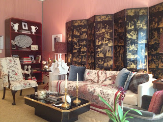
Living Room
Bedroom
Bedroom
David Phoenix
The Celt reflecting
Bedroom
David Phoenix
Details
Bedroom
David Phoenix
Wall covering and gimp
Bedroom
David Phoenix
Carpet, as if hand-knitted by giant sailors
The spaces in show houses that get the least coverage are the ones that are the most difficult to deal with and which test a beginning decorator's mettle. In a traditional townhouse, what does a decorator do with all the little nooks, the passages, vestibules, hallways, that Beaux Arts architects dealt with so cleverly? In the case of the Arthur Sachs house, I seem to remember bar after bar – and why not? A bar being the perfect place for a beginning designer to show finish, sparkle and glamour without breaking the bank.
Bar
I wish I knew by whom
A staircase, not the easiest space to decorate – especially when the walls curve and picture frames, generally speaking, do not. I must admit, I found Philip Mitchell's staircase quite beautiful with its toile paper more a texture than the soppy dominance toile can be, and the most understanding background to a delightfully eclectic accumulation of pictures that went from lower floor to attic. I loved every panting step of the way – especially the grace note of a tulip vase from a potter whose business card I've since mislaid.
Staircase


Landing/Lounge Area
Tilton Fenwick's lounge area bodes well for their future but the decision to befringe the dado rail was a touch too much for me. I understand the space is one of contrasts: the roughish wood cabinet front encased in smooth lacquer; the Renaissance Revival chair upholstered in a smooth weave suggesting almost that the more fitting fabric, an ikat, had refused to be used and had laid sulkily on the floor; the traditional Indian scene, a modern photograph in a simple white frame, hanging on Indian-derived paper; even a plastic orchid pot seemed to fit in an oddly sophisticated way.
Then, as I headed down towards the kitchen I walked into a magical space by Bennett Leifer – an anteroom to the kitchen, a transition from the backstairs, aglow with gilded wallpaper, a rock-crystal star and rock-crystal sconces. Pure, unadulterated magic – too ethereal for the likes of my iPhone camera so I have used Mr Leifer's own photographs from his website.
Anteroon
In the lobby, as we were leaving, I remarked I had not seen Jamie Drake's room to which there came a number of practically audible eye-rolls. "You're in it!" said the Celt. Indeed we were, and very lovely it was, though all too easily overlooked amidst the hustle of ticket buying and catalog grabbing.


.JPG)


