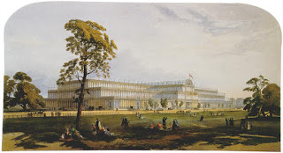
Yet I wonder if the Great Exhibition of the Works of Industry of all Nations gets more than a passing glance in present-day design school curricula, so much is there to be covered with the emphasis being on contract/commercial, not residential, design. Not to notice the Great Exhibition of 1851 as part of a History of Architecture and Interiors course would be a very odd choice because one might posit that is where the modern concept of design began, as did the still-current conversation about design quality. That the concept of design took root and flourished in the ensuing debate about the aesthetic horrors created by machine production on exhibit at the Crystal Palace is history that should not be forgotten, pertinent as it is to today, one-hundred-and-sixty-years later.
False Principles of Design and Other Legends of the Past
Perhaps the greatest legacy of the Great Exhibition of 1851 is The Victoria and Albert Museum,"the world's largest museum of decorative arts and design" with a permanent collection of over four million objects. The Museum opened its doors at Marlborough House with its inaugural exhibition about false principles of design – an attempt by Henry Cole, the Museum's first Director, to define the principles of good and bad design.
Curtain rod holder
1848
Henry Cole's purpose in holding the exhibition and the seventy-eight objects it showcased was to deter the public from buying goods held to be unsatisfactory and to educate them in matters of taste. A quotation from an Appendix to the exhibition catalogue, illustrates the strength of Henry Cole's dissatisfaction with the industrially-produced goods of his day.
"There has arisen a new species of ornament of the most objectionable kind, which is desirable at once to deprecate on account of its complete departure from just taste and true principles. This may be called the natural or imitative style, and is seen in its worst development in some of the articles of form."
Wallpaper
with perspective representation of the Crystal Palace and Serpentine
1853[?]
"The reception accorded this exhibition quickly proved that Cole and his assistant, the artist Richard Redgrave had rather misjudged matters. Every article selected for the exhibition, however unprincipled its design might be, was at least commercially very successful. The public were merely amused by the selection but remained unconverted. The manufacturers whose products were criticised were mortified and immediately complained. The exhibition was closed after only two weeks."[My Italics]
Gilt brass and glass gas lamp bracket
1848
In the False Principles exhibition, this bracket was stigmatized as "direct imitation of nature" and thus held to be unfit for its purpose.
Roller-printed and glazed cotton
circa 1850
The chintz above and the printed cotton below were chosen as examples of bad design because of the realistic imitation of nature, and the effect draping or folding the textile would have when used in a room.
Hollyhock
Printed Cotton, circa 1850
The reaction to the Great Exhibition – fundamentally a discussion about good taste and bad taste, with the Aesthetes losing every skirmish on the middle-class battlegrounds then and since – is relevant to today not only because, history being what it is, the pendulum has whizzed round a few times, and we're back where we were – maybe.
The aesthetes, the purists, the minimalists, the expounders of principles such as "fitness for purpose", rightly or wrongly, lose every time the wheel of fashion turns, because the rest of us want our cosy world filled with as much novelty as possible. Any real notion of taste is long gone; "taste" is a word that makes us a little self-conscious, is even pronounced in Italics. And, to be honest, I'm glad of it. Whether or not this is a good thing for the environment is a discussion for another day.
Each of the five examples I borrowed from the Victoria and Albert Museum – the curtain finial, Crystal Palace wallpaper, gas lamp bracket, chintz and printed cotton – is attractive by today's standards (or, if you are a strict Modernist, probably not). Aesthetically speaking, I'm promiscuous, so I love 'em all, and possessing a fifty-year-old hand-blocked length of the Hollyhock linen I've decided to have a blazer lined with it.
The five images below are of newly printed carpets by Moooi. Printed carpet, long the unmentionable poor relation frequently seen hanging around many a roadside rug sale, has now come out of the industry closet with a photo-realistic smack between the eyes – to say nothing of a final broadside to notions of taste.
Eden Queen
Marcel Wanders
Crystal
Marcel Wanders
Jewels Garden
Maison Christian Lacroix
Seaweed
Ross Lovegrove
Imitating nature, industrial revolutions and twenty-first-century photo-realism
Whereas Henry Cole and his associates were horrified at the nullifying effect of the Industrial Revolution on the hand-made craftsman aesthetic thereto customary, we today have for so long lived with an orthodoxy of industrial processes that has made craft something of Etsy tweeness or, at the extreme, an artistic wannabe, we are inured to it all. Of course, to every such blanket statement there are exceptions which are worth noting.
Henry Cole and his fellow exhibition organizers found few supporters in the general public and the manufacturers of his time, but the Arts and Crafts Movement that came after him was influenced by his ideas as were, in their turn, the early Modernists, and here we are nearly two-hundred years later in a post-industrial society, in a technological revolution watching an interior design industry in its death-throes still producing printed textiles that probably would have given Cole apoplexy, but excite the rest of us with their novelty or, perhaps more importantly, in the case of chintz, the lack of. Plus ça change.
Photographs of Moooi Carpets from Dezeen
Photographs of five objectionable objects from Victoria and Albert Museum
Images of Crystal Palace from Wikipedia


.JPG)


