Thursday, September 19, 2013

Settings

On Saturday, the Celt being at the Petshop Boys concert, I spent the evening with a friend, a gemologist, looking at stones and their settings. It struck me, over the second bourbon, that it takes a man who loves his subject to make it interesting to someone who doesn't feel overly fascinated by jewelry – even watches, cufflinks and rings have limited appeal – and, besides, it got me thinking about the importance of settings, and not just for gems. By the third or fourth bourbon we were having a raucous discussion about men's intimate jewelry and whether or not diamonds and platinum might be less embarrassing – impressive, even – when the TSA demands a strip-search after said intimate jewelry has set off the alarms. All a matter of the setting, I suppose, but I digress.

A remark by a friend that he was designing a pavilion for himself and now was looking for land in Virginia on which to build, had finally taken root in my brain and sent me to a part of my library – by this I mean not the east wing but a different set of shelves – to look for books about pavilions, follies, gardens and plants. I surprised myself by finding many a book about gardening and gardens (I like one not the other and I'll let you to guess which) and, lurking in "history and biography" a book I hadn't yet read or knew I had. The Architecture of Happiness by Alain de Botton will join the pile of twenty-six yet-to-be-read books on my bedside table – books from friends, my old prof, the Celt and even myself on an occasionally regretted impulse.


If I learned anything on Saturday night it is that setting is of great importance if the stones are to be shown at their best but that best is relative thing and can change according to whim and fashion – much the same can be said for houses and their settings. It goes without saying – you'd think – that the setting should enhance the building, be it of a hermit's lair or Philip Johnson's Glass House, yet if one looks at the newer clear-cut, graded, minimally landscaped and shadowless suburbs around any major city then one wonders if setting was ever a consideration.


I don't know the final design my friend, a lover of orange trees and fragrant blooms, has chosen though I have been privy to a few of his ideas as to style. Neither do I know, but I suspect, what kind of setting he will create, but it will be beautiful – I hasten to add at this point that none of what I write or show here is meant to be either advice or influence. My personal taste whether in decoration or gardening is for strong contrast, for chiaroscuro, the sweet and the sour, the rough with the smooth, for dappled light and, above all, for scent and the patter of rain on leaves.


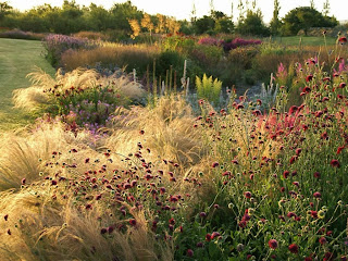
The photograph above , of a then new garden designed thirty years ago by Arabella Lennox-Boyd for her childhood friend, now the dowager Queen of Belgium, at Le Belvedere, in the grounds of the Palace of Laeken outside Brussels. A beautiful attempt, it seems to me, to humanize the scale of formality and the structural emphasis beloved of André Le Nôtre, set within it Arts and Crafts drift planting, form, texture, scent, light and shade, and moments of repose, and embed it in a lush Capability Brown-style park. I wish it were possible to see it now, nearly thirty years later.


The idea of rooms in gardens, not a new one, persists still – the white garden below, by the late Lady Adeane, epitomizes for me the English garden in all its highly-designed antiquated romantic beauty.


The following gardens are by Pied Oudolf, the garden designer par excellence, plant designer of New York's Highline and in my opinion one of the most exciting garden/landscape designers working today.


As attractive as the idea of garden rooms is, it has begun to feel more than a little passé – and this is the problem with fashion, as pervasive in garden design as it is in interior design. The grandeur of André Le Nôtre's designs for Versailles, influential all over Europe, gave way eventually to the English Romantic style of "Capability" Brown which in its turn gave place to Italianate gardens which in their turn gave way to ..... and so on .... until, arguably one is left, nowadays, with a blob of bright annuals around the mailbox, foundation plantings uniform from subdivision to subdivision, lawn after lawn, bereft of shade and peopled with "cement" replicas of geese, goddesses, urns and, occasionally, the holy family.


Arabella Lennox-Boyd's garden plan and photographs by John Vaughn from The World of Interiors, September 1985.

Photograph of the Philip Johnson Glass House from Architectural Digest.com as is the photograph of the Highline.

Watercolour of a thatched 'hermitage' from Garden Mania: the ardent gardner's compendium of design and decoration.

Photograph of the white garden from David Hicks's My Kind of Garden.

Other photographs of the work of Piet Oudolf from oudolf.com

Friday, September 6, 2013

Apropos a po


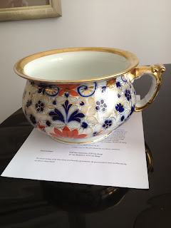
Despite telling everyone we know that after thirty-four years together we neither needed nor wanted anything, we received two wedding gifts  – one a beautiful old piece of Meissen from my old prof and, only last week, a colourful and gilded, if disconcerting, chamberpot. "WTF," said the Celt, when he saw it for the first time. Mild-mannered as he normally is, seeing a chamberpot, or po as we both knew such an item, on the dining table threw him, I think. 

There was a time when bathrooms moved inside and chamberpots, in theory, were no longer necessary and as late as the 1960s they flooded antiques stores in Britain (I remember Portobello Road, so many chamberpots on display, it looked as if the market had prepared itself for an epidemic of dysentery) and it was thought amusing to deal with them as cachepots and display them in a daring, if whimsical, way and, frequently atop an art nouveau-ish pedestal. The spider plant, looking for all like a big splash, was the favorite. Never got it, myself, but each to his own. 


However strongly I theorized about an aesthetic tension between a mid-nineteenth-century utilitarian object and an early twentieth-century iconic modernist table it was a friend's fixed grin that convinced me it did not look good on the coffee table. Unimaginable as it is to use it for the dining table or even as a vessel for nibbles at a cocktail party, and the idea of using it as a plant pot is just too waggish, we are faced with what to do with a gorgeously decorative po. Thus, as we wait for inspiration to strike, it sits in the office, bracketed by pairs of red sandstone carpet weights, high on a shelf, the whole ensemble looking like some forgotten souvenir of the Raj. 


Remembering as I do the freezing bathroom of my childhood – in winter the windows had ice on the inside – I cannot, nowadays, bear an uncomfortable bathroom. I don't need carpet, though a good thick toweling bathmat is welcome if the floor is unheated – that 1980s decorette mode of creating a "country house" bathroom to look like a conversion from a bedroom or library was not and still is not to my taste.

Having gotten used to Italian hotel bathrooms, marvels of compression and utility that they are, they have given me a taste for the luxurious finish – marble-clad bathtubs, vanities and shower stalls, mosaic paneled walls, heated towel rails and flattering-to-early-morning-skin paint colors.


It's not easy to think of bathrooms as being timeless yet the functions are quite clearly defined and unless there is drastic change in human physiology those functions of elimination and cleanup will remain as they always have been. A third function, essential of course, is to provide lighting sufficient to the task of performing the necessaries efficiently. Anything else ascribed to the space, be it as a retreat or spa, is just fluff designed to appeal to the aspirational and envious amongst us – as pleasant as it might be to have warmed floors and towels, the costliest of marbles and glass, and every scented candle known to mankind.

 
The first bathroom is by William Sofield, photographed by Fritz von der Schulenberg and taken from Mr Schulenberg's excellent book Luxurious Minimalism, and is the definition of aspirational from my point of view, that is.

The second is by Tino Zervudachi from his book Tino Zervudachi: A Portfolio – another excellent book that I frequently dip into. Having been raised without a shower and only a tub, I feel if I ever see a bathtub again it'll be too soon, still I love this bathroom – despite the wc and bidet being by the window. Below the window, by the window or across from the window doesn't matter but when it's in full view of the neighbors be they human or flying squirrels, I demur.