Friday, March 30, 2012

Going to the Dogs with Earl Blackwell

"Raffles is the latest and gaudiest of the private clubs around Manhattan, and when I report that Cecil Beaton designed and decorated it, perhaps I have said everything. Mr. B. is the most aesthetic of men and in his photographs, drawings and stage settings, you can almost hear the flapping of Peter Pan's wings. Although, with the new club, he has check-reined his gossamer flights a bit.

Cecil has not always been closely related to men's clubs, but for this one he says he took a long look at 'men's clubland' and proceeded accordingly. Most of the colors are dark - the carpeting has a black pattern on deep reds, blue and browns - and the dining room walls are covered with dark velvet. There is a kind of informal bar, including such anachronism as letter racks, fly whisks and caviar sandwiches as a sort of free lunch, and even a dozen portraits - some of them Beaton's own - of beautiful women. He has no plans, he says, to hang Twiggy. 'Her features are lovely and so are her proportions (what's he say?),' he notes 'but she gets herself up to look like a mess.'

"As private clubs in New York go, the tariff is about par for the course. Five hundred initiation fee, annual dues of $350 - and, of course, the old standby of having a speaking acquaintance with at least two board members. The board roster is a gasser: Douglas Fairbanks Jr., Count Teo Rossi, George Plimpton, etc. The name Raffles, was not Beaton's original choice. He wanted to call it 'Dogs,' because it 'would have been such fun to say 'I'm going to the Dogs tonight.' "


Not what one would expect, but amusing, nonetheless, an image of Cecil Beaton up a ladder flinging down paint to create the design for the splattered, splotched carpet that covered the floor at Raffles. More expected, perhaps, is the idea of him and his aide Robert LaVine* touring Second Avenue in a limousine looking for antiques to decorate the club. Beaton, still in his My Fair Lady Edwardian manner, created an interior lit, or so it looks at this remove, with the glow from many a table-side flambé.


Other than noting my initial surprise that Beaton was the decorator of Raffles, I don't really want to add more to the already deep pool of blogger gush about him or his mildly repellant generation - Wallis Windsor, Beverly Nichols, et al.

I'd rather concentrate, instead, on Earl Blackwell, who as Chairman of the Board of Directors gave a party "... for Noel Coward at Raffles, which is full of photographs of celebrities. I removed every photograph in Raffles and replaced them with photographs of Noel taken through his entire career. It was a great thrill so see him go from picture to picture, some of them taken when he was very young, some of them with Alfred Lunt, Merle Oberon, Beatrice Lilly, Cary Grant and many more. They were all there."

Earl Blackwell, editor of Celebrity Register; founder of the publicity agency Celebrity Service; the man behind Marilyn Monroe's singing of Happy Birthday Mr President; and the happy owner of the most beautiful ballroom in Manhattan, was a native of Atlanta - the city where, when in town, he shared a Michael Greer-decorated, eight-bedroomed carriage house with his sister and her four children.

"The party I enjoyed most, recently, was my first party in my Atlanta home. Ginger Rogers was in Atlanta for the first time so she was guest of honor. I invited forty of my friends in Atlanta for a seated dinner. I had five tables of eight and I named each one after a Ginger Rogers film. One table was 'Top Hat,' one was 'Flying Down to Rio,' etc. When my guests arrived, each was given a card with the name of his table. Then during the evening, Ginger moved from table to table, starting with 'Kitty Foyle.' "


Blackwell's twenty-feet-high ballroom, his party room, originally the solarium of the penthouse at the Briarcliffe apartments, was painted with Venetian-style murals in 1958 by William Hankinson - murals** that were damaged by water in succeeding years and then finally destroyed in a 1999 reconstruction when the building became a condominium. The room was recently redecorated by Mario Buatta.


Earl Blackwell, famously, did a lot of entertaining in the ballroom and in an interview said that his guests ".... leave the elevator, come into the entrance hall and immediately see a bar. That represents security for many people. And, you know, people don't like to walk into an enormous room until others are already there. If you have a little bar area where they can immediately go for a drink, several groups will gather then drift into the large room.


"No one likes to be the first guest to arrive but someone has to be the first, so you must offer the courageous early-comers confidence. I do think lots of effort should be made at the entrance in every way possible. I always have more flowers there, usually pink carnations or pink and red roses to give my guests a lift the moment they arrive. If they feel 'up' in the beginning, they can sustain that feeling throughout the entire evening."

William Hankinson's murals only lasted about forty years, and instead of restoring work that was a proud descendant of a tradition going back at the very least to Tiepolo, why anyone would sweep away such beauty and replace it with - and this is no slight against Mr Buatta - late-twentieth-century traditional decoration beats me.

Going to the Dogs, indeed.


Photographs of Earl Blackwell's ballroom and entrance hall by Max Eckert to accompany an interview by "The Editors" of Architectural Digest, September/October 1972.

Quotation from My New York written by columnist Mel Heimer for Reading Eagle, November 12, 1968. Source: Google here.

Photographs by Alexandre Georges to accompany uncredited text, from which I took notes, in Architectural Digest, September/October 1971.

* 1970 Tony Award© winner for Best Costume Design for Jimmy?

** Source here.

Friday, March 23, 2012

Drape in haste

Living, as we do, in a light-filled flat with south and east exposures, whole walls of glass in each room, excepting one, it quickly became apparent that eight linear feet of dark brown mohair velvet slumped like a depressed, three-hundred-pound bear at one side of the room absorbed too much light and, perhaps more importantly, didn't exactly look well-tailored - thick wool pile doesn't lend itself to neat seaming.

It took three years to finally admit to each other that neither of us liked our sofa but, one Sunday recently, the Celt broke the early morning silence with the statement that he wanted rid of the dark brown mohair and, further, an option would to get rid of the sofa altogether. Not being able to face yet more forays into the showrooms looking for frames, the sofa is now in the workroom being recovered in a camel-colored wool from Kravet - a stuff with much the same hand as the camel sports coat or overcoat that used to be in each man's wardrobe.

One thing leads to another, of course, and since they were installed three years ago, I have grown increasingly dissatisfied with the blue silk taffeta curtains, pretty and delicate as they are, and I am looking for a replacement - drape in haste, repent at leisure, as it were. Below you can see the three fabrics I'm considering.


Lee Jofa's silk, white, pale grey, and lilac-blue, slubby, weighty and a real ikat, not printed, is fascinating and I'm having a real problem deciding against it. I fear it will take the room in a direction I'd rather it not go by making it a bit too haughty - and it's a lot of grandeur for a room to live up to.

The linen and polyester sheer has just about the right weight to filter light and will add a subtly-patterned verticality to windows broader, at fourteen feet by just over nine feet, than they are tall, but give absolutely no insulation against cold (as would the silk ikat if lined and interlined). Sheers unbracketed with curtains seem unsatisfactory to me yet we live in a 1960s brutalist modern building and the rooms are unencumbered by crown moldings and elaborate millwork. I wonder if sheers alone without the visual complication of over-curtains might give the room a more contemporary feel.

The third fabric from Lee Jofa, a heavy-weight linen, almost a smooth burlap, is a piece of nostalgia: its handblocked feel takes me right back to my years at college when I learned and enjoyed all kinds of printing from lino cuts, wood cuts, wood engraving, even letterpress, to lithography on stone. I love the texture of the ink and how it interacts with the surface on which it lies, and so it is with this linen with its crusty application of pigment. The design, by Peggy Angus, decidedly of yesteryear, will lend a home-spun, if spurious, Englishness to the room and take it down a notch or two.


Peggy Angus, who died almost twenty years ago, was of the same generation as Eric Revilious, Edward Bawden, Henry Moore and Barbara Hepworth. I first read about her in the World of Interiors a decade ago, though, looking back now, seeing her work then came as no surprise to me - I must have been conscious of her work during my years in design school. Her obituary in The Independent, a quotation from which follows, will tell you all you need to know about her, her work, and her place in twentieth-century decorative arts.

"In 1960 she won the Sanderson centenary competition for wallpaper design and her patterns were use by Cole and by Sanderson. But she designed few machine prints, preferring the less predictable effects of hand-printing, using small lino blocks and household emulsion. [latex paint]

"These labour-intensive wallpapers made her belief in creative patronage manifest. Clients were encouraged to have blocks specially cut and to participate in their design. The beauty of her handblock papers has been recognised above all by artists; partly because unlike most wallpapers they form the ideal background to paintings. Over the years Angus invented an extraordinary range of patterns. Many were abstract but others convey a vivid pastoral mood, making subtle use of oak leaves, heraldic dogs and birds, grapes and vines, corn stooks, stylised suns and winds. They seem rooted in the natural world and in the visual arts of the British Isles, from the Celtic pattern to heraldry to the art of bargees and gypsies."


Peggy Angus in her Camden living room (the house now demolished). Note wallpaper and tiled fireplace surround.


Peggy Angus also has two pictures, done in the 1930s, in the National Portrait Gallery, London: Ramsay MacDonald with members of his family and John Piper. Piper, a friend of Angus, interestingly, is seated in Alvar Aalto's Model No.31 chair - the first chair to cantilever laminated wood in its structure - before what could be his own painting Forms on Dark Blue


John Piper, from whom Queen Elizabeth commissioned a set of views of Windsor Castle after seeing his work in the Recording Britain project at the National Gallery in 1941, also recorded the bombed fourteenth-century Cathedral of St Michael at Coventry the day after the bombing and went on, twenty years later, to design the glorious Baptistry windows of the mid-twentieth-century cathedral. 


Piper's watercolors of the wartime Windsor Castle hung during the Queen Mother's lifetime in the Lancaster Room at Clarence House which is a far cry from Furlongs, Peggy Angus' rented cottage which had no hot water, indoor sanitation or electricity and to which Eric Ravilious paid tribute when he wrote: 


"I was glad you liked my new pictures. The Furlongs period is more or less responsible for all of them, as I never could paint the Essex scene with much enjoyment. Furlongs altered my whole outlook and way of painting. I think because the colour of the landscape was so lovely and the design so beautifully obvious (only because Essex is walking country to me, and a place to play ball games) that I simply had to abandon my tinted drawings: and high time too. It was very clever of you to find a place like that and I shall always be grateful to you for the excitement it gave me."


When I began this post, I was concerned, ostensibly, only with thinking out loud the process of redoing the living room but when I wrote of the Peggy Angus linen that it "will lend a home-spun, if spurious, Englishness to the room" I knew I was still concerned with a theme I had begun last week in my post about Arthur E Smith - a sense of place. I shall likely ramble back to it.


Photo of Peggy Angus from The World of Interiors, September 2002.

Blithfield and Co's Peggy Angus textiles available at Lee Jofa.

Second and third patterns from Fabric and Papers.

John Piper's Coventry Cathedral from here.

Photo (© The Royal Collection) of the Lancaster Room at Clarence house from Queen Elizabeth the Queen Mother at Clarence House, Michael Joseph Ltd., 1996.

Image of Furlongs (© Estate Eric Ravilious) from The England of Eric Ravilious, Freda Constable with Sue Simon, Lund Humphries, 1982

The blue streak to the left of the image of the printed linen is thanks to my twelve-year-old scanner. I really should get a new one but like much which is old and cranky it still works, if only after a fashion, and looks better on my desk than it would in a landfill.

Tuesday, March 20, 2012

The first true thing


"Spring - Primavera, the first true thing, as the Italians call it - has come. The nightingales already begin to bubble into song under the Ludovisi ilexes and in the Barbarini Gardens. Daisies have snowed all over the Campagna - periwinkles star the grass, - crocuses and anemones impurple the spaces between the rows of springing grain along the still brown slopes. At every turn in the streets basketsful of mammole, the sweet-scented Parma violet, are offered you by little girls and boys; and at the corner of the Condotti and Corso is a splendid show of camellias, set into the beds  of double violets, and sold for a song. Now and then one meets huge baskets will with these delicious violets, on their way to the confectioners and caffès, where they will be made into syrup; for the Italians are very fond of this bibite, and prize it not only for its flavor, but for its medicinal qualities. Violets seem to rain over the villas in the spring, - acres are purple with them, and the air all around is sweet with their fragrance. Every day, scores of carriages are driving about the Borghese grounds, which are open to the public, and hundreds of children are running about, plucking flowers and playing on the lovely slopes and in the shadows of noble trees, while their parents stroll at a distance and with for them in the shady avenues. At the Pamfili Doria villa the English play their national game of cricket, on the flower-enamelled green, which is covered with the wondrous anemones; and there is a matinée of friends who come to chat and look on. This game is rather 'slow' at Rome, however, and does not rhyme with the Campagna. The Italians lift their hands and wonder what there is in it to fascinate the English; and they do not admire it. But those who have seen pallone will not, perhaps, so much wonder at the Italians, nor condemn them for not playing their own game, when they remember that French have turned them out of their only amphitheatre adapted for it, and left them only pazienza


"If one drives out  of any of the gates he will see that spring has come. The hedges are putting forth their leaves, the almond-trees are in full blossom, and in the vineyards the contadini are setting cane-poles and trimming the vines to run upon them. Here and there along the slopes, the rude antique plough, dragged heavily along by great gray oxen, turns up the rich loam, that needs only to be tickled to laugh out in flowers and grain. In the olive-orchards, the farmers are carefully pruning away decayed branches and loosening the soil about their old roots. Here and there, the smoke of distant bonfires, burning heaps of of useless stubble, shows against the dreamy purple hills like the pillar of cloud that led the Israelites. One smells the sharp odour of these fires everywhere, and hears them crackle in the fields :- 

Atque levem stipulam crepitantibus urere flammis"


Quotation from Roba di Roma, William W. Story. London, Chapman and Hall, 1863
Photograph from here http://n.casbas.pagesperso-orange.fr/textes/photo/page2.htm

Friday, March 16, 2012

Not from around here

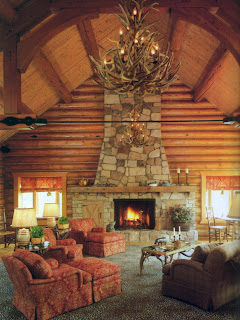
If he agreed with his erstwhile employer and partner, Billy Baldwin, that "decorators should provide a serene, uncluttered background for people, pictures, flowers, books, and the unavoidable confusion brought into a room by living," then I wonder what Arthur E Smith's reaction was when he first saw these lodgepole pine walls - surely one of the most unquiet backgrounds within which he ever had to work.


There is a certain power, if not grandeur, in this kind of architecture that defies, I would think, all reasonable attempts to work within it without resorting to bucolic triteness. Arthur Smith said "he didn't want to overwhelm the architecture"* showing a certain savoire faire on his part - and it does him credit that he did not resort to brobdingnagian-scaled furniture to fill the a ponderous volume. And, to a degree, this house, with its beamed wooden roof evocative of early churches, resembles more a godlet's man-cave at Asgard (though whether Early Asgard or Late Asgard is hard to say) rather than anything fittingly called a cabin.

Nowadays, allusion to the genius loci is a customary, if occasionally tiresome event in decorating, but it has an august history. If it began with Victoria and Albert spreading acres of tartan over the floors of their newly remodeled pile in the Cairngorms, I don't know, but it sure do go back a long way. Even more commonplace is allusion to the spirit of genius ibi - be it a Provençal mas in the suburbs of Texas, a Gustavian slott in Florida or an Umbrian studiolo in Hell's Kitchen - for, seemingly, somewhere else is more attractive than right here, right now - and it's an odd phenomenon.

Of course, the allusion in this case is not to where but to whom - huntin', shootin' and fishin' clients who, having done so over the world over, wanted finally to build a house - a reminiscence, though on the scale of a castle - of cabins they had used down the years.


The ossuary-like antler chandeliers, antler and brass tables, twig tables and chairs, rush-seated ladder-back chairs, scenic-painted sideboard, duck decoys, rhinoceros and bear figurines, salt-glazed pottery, birch-bark baskets; half-barrel cachepots, a vessel in the shape of a tree trunk, rustic pitcher and brass candlestick lamps with twig or raw silk shades, wool plaid, leopard-print carpet and needlepoint rugs - and the laciest curtains ever to grace a log cabin: sill-length, swagged, jaboted and chouxed, atop floral shades matching the print of the coverlet on the maple log bedstead - all suggest an homage to spirit of place, albeit seen through the rose-tinted lens of a rifle-sight, and to Smith's client's fashionable taste in Americana.


It is, I think, because we live in a world of globalized tchochkes, where Americana is more likely to be found in the pages of airline catalogues - and despite protestations by many a decorator that their work is uniquely American - that America as genius loci is less fashionable than it once was. To claim uniqueness suggests that their work is happening nowhere else. And perhaps in the sense that the Mid-Atlantic, the Anglo-American, or the Cotswold-Virginia Style - call it what you will - is more a provincial than a universal phenomenon - the style is unlikely to be current in Paris, Stockholm, Vienna or Istanbul - one could claim uniquity, at the very least.


*Quotation from Sporting Life at Fort McKee by Hunter Drohohowska,

Photographs by Peter Vitale to accompany text by Hunter Drohojowska, Architectural Digest, June 1991.

Thursday, March 8, 2012

Patience at breakfast

Not that I'm an lover of eggs, I rarely go to work on one and, despite an occasional hankering for bread fried delectably crisp and brown in bacon fat, for years have avoided that artery-blocker known to hoteliers as Full English breakfast, but one of the best things about breakfast in London is a well-poached egg.  Atop a flake or two of smoked salmon and part of what was called a healthy breakfast - muesli with berries, beetroot and carrot juice and fresh fruit - the poached egg I ate each morning at our London hotel was a real treat, except, that is, for the batty idea of serving it in a glass bowl.


Once, whilst traipsing around the wilds of Pennsylvania, the Celt, in one of those moments that make even partners of thirty-odd years mildly breathless with wonder, announced that the silicone egg poaching cups he'd just found were what he'd been searching for for ever. Given we haven't been inside a kitchen store for years, and eat between us no more than a half-a-dozen eggs a year and, if there were poaching to be done, I would be the one cussing doing it, I pondered, as one well might, the meaning of it all.

The tedium of standing over a pan of quivering water pretending that one even needs to produce an aesthetic egg has meant, as you might imagine, that the poaching cups, loll, unused, in a drawer with all the other must-haves no longer loved. Actually, my problem with them is that I can taste the silicone on the egg and so they are ostracized, much as are the eggs they're designed to hold.

This weekend we are in Manhattan to see Gilbert and Sullivan's, and the Celt's beloved, Patience at Symphony Space, and to visit with family and friends. Breakfast, rarely eaten in hotel dining rooms, for neither of us, will be an egg.

Saturday, March 3, 2012

A conversation piece


Fleet of foot I am not, yet one of my greatest pleasures is to walk. I kid myself I can walk for miles but, really, my limit seems to be but two, and then I have to sit - preferably with a waiter to hand. Inside a museum, where yards can feel like miles on the trek to the one thing in the place that whispers a word of welcome, sitting is frequently not an option.

It's not often that the portrayals of ancient gods and goddesses, all majesty, might and malice, make one feel kinship - largely they're ideals of human form and with all the distance that divinity brings. Not from them the dramatic gesturing, the mugging for the sculptor's chisel, as it were, that one gets from Bernini's angels and saints, the latter-day scions of the ancient pantheon, rather an unheeding solemnity rarely relinquished.

Hermes, elder brother of Dionysus, messenger of the gods, guide of souls across the Styx, protector of thieves, inventor of the lyre, and as divine a bad-boy as any of his cousins scattered around the Archaeological Museum, sits contemplatively on a rock, the living image of a neighborhood kid with a bloodied lip who, having just dropped into the peristyle for a chat, wonders if, despite all, he has been handed a bum rap.


"Well," I said to the Celt, "it just goes to show how much we are led by the nose not just by books and magazines but also by our own aspirations." I had just remarked, seemingly only to myself, that I'd like a copy of Hermes on the stone cabinet (a piece of 1980s whimsy in the form of a plinth ashlared in faux limestone) in our living room. The Celt, used as he is, he says, to my verbally completing conversations that hitherto have occurred solely in my head, murmured something noncommittal. But, to agree with myself at least, Hermes would look fabulous perched there in the living room -  a conversation piece, if ever there were one.

The question, of course, is why I want such a conversation piece, which surely it would be, in our living room. Be they tablescapes, acres of white phalaenopsis, asymmetrical arrangements of artwork or plaster casts of Classical torsos, I'm pretty resistant to alluring pageants of objets on offer in designer monographs, magazines and eBay. Yet twice now, I've had the same strong response - I want - to two objects; the first a bronze monk who now resides in our bedroom, and now this statue of Hermes. In each case, it is not the connection with religion, but the clear humanity of them both, that speaks to me.


iPhone camera notwithstanding, and as much as I might have wished, I couldn't kneel at his feet.