Wednesday, September 7, 2011

A country house

During the last few weeks as my life creaked its way to back to normality, I did much planning of the country house that looms large in my imagination and which, despite all my attempts at getting us to reconnoitre lake and mountaintop, we have yet to buy.

It's the English half of me, I think, that longs for a house in the country - I read somewhere an acerbic comment that when Brits make a pile of money they all head for the country, heads filled with notions of joining the gentry, to refurbish every bothy, parsonage and manse in sight - whereas the American half rather would like a snappy little cottage, fit only for ourselves and a couple of friends, atop a gusty dune by the ocean. The Celt, raised as he was by parents who for various reasons lived in the Scottish hinterland, considers the countryside nothing more than psychical and cultural wilderness, brimming with rain, flies and shit. Undeniably, the countryside does have a lot of each, but my relationship with a romantic idea remains strong despite me knowing that, were I there, I'd probably spend a lot of time sloshing, swatting, dodging and squelching. The Celt, as I say, does not think as I do.  

I can accept that one might, romantically, wish to connect the interior of a country house to its surroundings - give a nod to the spirit of place, as it were. I accept, also, that in the language of design there is a degree of cant - conventions and pieties that seem to express an esoteric level of connection. For example, the once de rigeur phrase bringing the outside in has been supplanted by a more mystical honoring of the landscape beyond the windows - a paying of tribute, nymph-like, to the trees, the streams, the flora and fauna. What it means, of course, is that wicker, grass, rust, distressed paint, driftwood, flour-sack pillows, litters of herbal, avian and floral motifs, even a jelly-jar or two, aflitter with lightening bugs, cosy up together with hand-adzed beams, reclaimed barnwood walls and floors, faded oriental carpets, crusty antiques from last week yesteryear in a tasteful tizzy of rustic whimsical cliches. None of it actually risible, if that is what you like or, at least, lust after, but to me it is about as real as the stylist's set pieces in magazines where one sees tea tables set out on a lawn or under trees - as if there wasn't a fly, mosquito, a chigger, flea, tick or snake within a million miles.


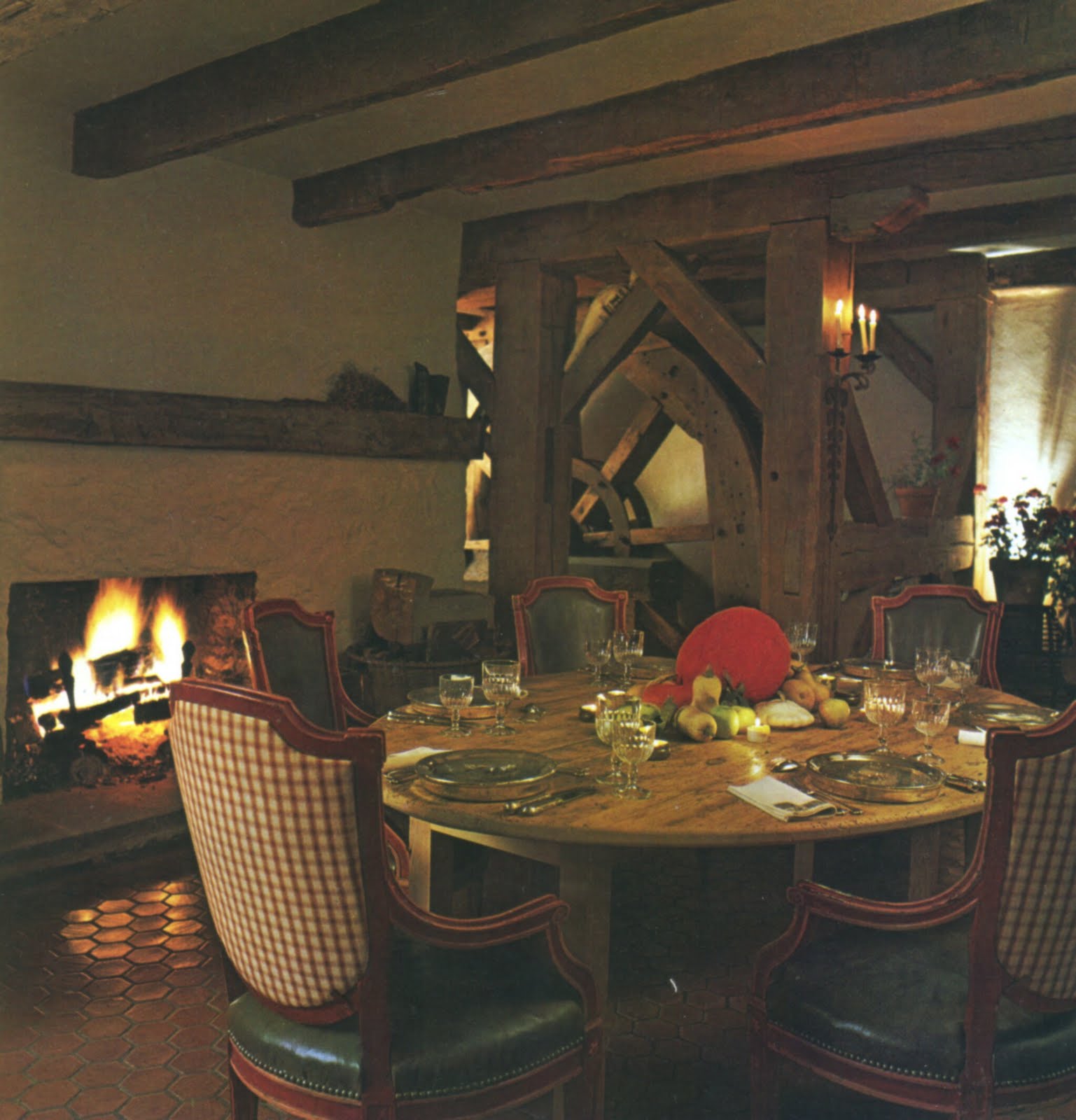
Our friend Will emailed to tell me about photographs of David Whitcomb's country house that he'd found and another friend kindly lent me the book. I recognized it immediately, of course - somewhere here there's a box of clippings amongst which is the original article about the house - I was so impressed thirty-odd years ago, when I saw the photographs for the first time. In fact I still am, and it's quite clear that Mr Whitcomb had no truck with a gimcrack pantomime of country life. His house, a converted mill, which he enlarged with a stainless-steel structure as simple as a child's building block, became his year-round residence after he gave up his city apartment.


I could bang on about Mr Whitcomb's sense of place, his appreciation of the structure of the old mill, his taste in furnishing it, and how the more contemporary room, the steel studio, has stood the test of time, but I don't need to - its clear from these photographs.

And it's clear to me that this is precisely the kind of house I would like for us to inhabit. Oh, I don't necessarily mean a mill-house, though that would have its charms; rather, a house comfortably and amply furnished, cognizant of infirmity and youth, and with those most valuable of commodities: space, peace and quiet.


Photographs of David Whitcomb's country house from Architectural Digest: Country Homes by Daniel Eifert to accompany "original text adapted by Cameron Curtis McKinley." The Knapp Press, Los Angeles, 1982.


Monday, August 22, 2011

Wet days, a mountain view, and the progress of love

Hard to imagine, perhaps, but one of the most beautiful aspects, to me, of the Frick Collection, is the muted murmur, the continuous crackle and creak underfoot, of the wooden floors. On a rainy day, as it was a couple of Sundays ago, that softest of sounds had but one counterpart in the soft splash and plop of rain on leaf and pond - the sound of introversion and contemplation - in Russell Page's beautiful courtyard garden, itself a reflection of the court at the centre of the museum which, in its turn, is nothing more than the atrium with its peristyle and impluvium of Ancient Rome.  

The night before we'd talked at dinner, the four of us, about second homes - for me enticing but for the Celt, a not-so-captivating idea. For our friends, two men from London, a second home was nothing more than an extra expense, extra responsibility, etc., a dismissal so heartfelt and final I was glad I was old or wise enough not to argue. I understand all the arguments against such an establishment but, much in the way the Frick's courtyard garden attracted me because of its sense of enclosure and separation from the noise of the city, so does a small place - a recourse rather than ivory tower - surrounded by woodland, within the sound, if not the sight, of falling water, blind to the road but open to a courtyard that captures, each in its season, the fall of sun, moon, rain, snow and leaf.


Another drenching storm had passed when, last weekend, we drove up the steep and winding road to the great white house atop a mountain in North Carolina. A weekend house filled with elegantly dressed people invited to meet two of the the Million Dollar Decorators, and from which the mist-softened panorama of the wooded slopes of the Appalachians came as such a beautiful surprise. To stand, even for a few minutes, under a sky no longer ominous but still flickering with lightening, deaf to all around and looking at a view so rare, was the most invigorating of moments.


It is hard to say how many times over the years I have visited the Frick but it has never palled. The Fragonard Room, in which his The Progress of Love is arrayed, is the perfect room in which to while away a book-riddled hour or two on a dim, wet and fire-lit day. These paintings, at the end of the 18th century, having been rejected by Madame du Barry, came to hang in Fragonard's cousin's house in Grasse. This reminds me, as an aside, that Roderick Cameron described Charles de Noailles, who had a villa and garden in Grasse, as one of the world's great gardeners - a compliment indeed from such a talented man as Cameron.

Our two friends from London, and this is their progress of love, asked us to go with them the following Monday to the Office of the City Clerk in Manhattan and witness their wedding - which we did, in the lavender-decorated ceremony room. I'm pleased to say that neither the color scheme nor the continuing rain dampened their ardor.

Photograph (cropped) of Finnish cabin from 1609 by Paul Wistman, accompanying text by Klaus Eriksen, for The World of Interiors, January 1986.

Image of Fragonard's The Lover Crowned from Wikipedia Commons.

Wednesday, August 10, 2011

I need what?

"Oh, you need a three-hundred-pound seat" the brisk female voice on the other end of the phone said after I had explained, as delicately as I could, and without embarrassing either of us, that ... well, let me put it this way, and without being overly euphemistic, both bodily functions could not take place at the same time within the aperture of the seat of the "beside commode" I'd been given when I left hospital. The aesthetic desecration of our Philippe Starck-designed toilet pot caused by this baldly utilitarian object, with its white tubular construction, grey plastic lid and splash guard, was of little consequence compared to the ease promised by its 21-inch-high seat - six inches higher than the one above which it hovered - a promise short-lived in the event, for the reason given above. If I understood that person correctly, this method of assessing the required dimensions of a toilet seat – by the weight of the user - was new to me and, it has got me wondering about what I know.


It is only at times like these, in my case a temporary disability, that it comes upon one that the beautiful rooms one has gone to great lengths to create come up short in one vital aspect - accessibility. I found that much of our furniture, except the bed, no longer worked for me – or rather, with me. Until this week, the fourth since surgery, there has been but one chair – one of a set of four Provençal dining chairs with arms we bought 25 years ago in France – that has been in any way hospitable to my condition. The chairs and sofa in the living room, the library and the bedroom, all by well-known designers and from reputable manufacturers were, variously, too deep, too low, too springy, or too soft - qualities which in normal times may be much appreciated. We got the decoration right, but what we forgot was to make the rooms usable in all sorts of conditions. So, for a month, I have perched like a petulant parson on a dining chair, surrounded by furniture I could not use, immensely thankful for the arms (in more ways than one) that surround and support me.

I sit now at my writing table, in another of those Provençal chairs, propped by a pillow at my back, and though this morning I heard from the surgeon that everything has gone brilliantly and I may drive and fly again, I'm still too wary of the other furniture to try and sit in it. Sit in all I shall, eventually, but the lesson has been learned - function is prime. It is the ergonomics, the universal user-friendliness informing the design of furniture that counts.


This morning I looked around at the surgeon's waiting room and thought again what a difference there is, generally speaking, between the residential side of the interior design profession and the contract side - not necessarily a difference that is universal but one that comes down fundamentally to the training either side receives.  There was so much space, though none wasted, for allowing free movement of wheelchairs, walking frames, and couples side-by-side supporting each other.

At home, when we remodeled, we got our openings – the doorways – right, in that I was able to get the wheelchair and, later, the walking-frame comfortably through them – not something that could be said of many houses around this nation. But where there is a registered architect, a licensed interior designer or an experienced interior decorator involved, there should be no problem with clearances or accessibility in residences, and there will be a universality of design - the rooms will not be hostile environments to those who are in any way, and however temporarily, physically challenged.


Drawings of chairs by Emilio Terry from an article written by Marie-France Boyer for The World of Interiors, November 1987.


Wednesday, July 27, 2011

Whoa!

We had planned so much to do in London and Manchester - not the least of which was to visit the Victoria and Albert Museum's The Cult of Beauty: The Aesthetic Movement 1860-1900 and, nostalgically for me, in Manchester look at one the best collections of Pre-Raphaelite paintings anywhere, paintings I'd not seen, outside of books, for many a long year. So much planned and commensurately such a disappointment in having to cancel - not on a whim, but out of necessity. A disappointment heralded by the PA's reaction on his first look at my MRI films. "Whoa!" he said, with awe in his voice, "I've never seen anything like this." It confirmed, I suppose, what we already knew, but had gone unspoken, about having to cancel the vacation - this after an epidural, the onset of "dropped foot" in both legs, and a return, despite the epidural, of the worst sciatic pain I'd ever had, followed by a fall flat on my back in the shower, and the fact that I was in a wheelchair. I thought "whoa!" was a fair reaction to what he saw. 

So, an unplanned break from blogging having ensued, as has surgery and physical therapy (ongoing) I'm now able to totter, with the use of a cane, to my desk and sit for a while, fogged a little from the medication, and wonder what I'm going to write about. I have read so much the last four weeks but somehow don't want to turn this post into a "what I read this summer" grade school essay but, nonetheless, when you're flat on your back for a couple of weeks there's not much else to do but read.

I mentioned a few weeks ago how I'd finally come round to e-books and was quite enthusiastic about them. I still am enthusiastic but, much as with p-books, e-books are a mixed bag in terms of design, typography and proof-reading or the lack thereof. Many e-books are poorly typeset, with total disregard for basic typographic principles – more "widows" and "orphans" than a Dickens' novel, captions cut adrift from the illustrations they describe, letter-spacing choppy at best. This might be excusable in the free e-books, on the basis that one is getting what one has paid for, but the same problems regularly arise in commercial e-books, too.

Paradoxically, at the same time as they appear to flout the basic good manners of typography, many e-books also seem locked into a "print" mindset, and fail to take advantage of the potential of the new online medium. Like the online shelter magazines I discussed here, they seem to designed by people whose training is in print, and not in web design. Both e-books and e-magazines are designed - though "design" in this context implies intent - to resemble their print counterparts. And that, to me, is the intrinsic flaw. Why, given the capabilities of digital linkages, am I still having to turn the digital page, and in the case of e-books why are the illustrations bundled together in sections as one would find with a print book? As I say, e-books and e-magazines, as I experience them, are designed by people who were trained in the limitations of print - limitations that do not, or should not, exist in e-design. The nearest I have come in my search for what I think an e-magazine should or could be is Flipboard.


So, what did I read this summer?

A terrific read, the top of my list, despite the fact that because of medication I found it hard to concentrate for long, is Rome by Robert Hughes - a book not yet published in the United States - a highly personal account of the city of Rome from its founding to its present-day cultural destitution. A quotation from the last chapter gives a good sampling of what you might expect from this book - a quotation, I think, that pretty well sums up the cultural meagerness of the present day, and not just in Italy.

"..... It has got worse since the sixties with the colossal, steamrollering, mind-obliterating power of TV - whose Italian forms are amongst the worst in the world. The cultural IQ of the Italian nation, if one can speak of such a thing, has dropped considerably and the culprit seems to be television, as it is in other countries. What is the point of fostering elites that few care about? It bestows no political advantage. In the wholly upfront culture of football, 'reality' shows and celebrity games, a culture of pure distraction, it is no longer embarrassing to admit that Donatello, like the temperature of the polar ice-cap or the insect population of the Amazon, is one of those things about which you, as a good molto tipico Italian and nice enough guy, do not personally give a rat's ass."


William Shawcross' Queen Elizabeth The Queen Mother: The Official Biography, my first e-book, led me to Queen Elizabeth The Queen Mother at Clarence House, by John Cornforth, a book about the history of the house itself and the role of the Queen Mother as art collector; thence to Christopher Hussey's Clarence House published in 1949 to commemorate the then-newly-married Princess Elizabeth and Duke of Edinburgh setting up home together at Clarence House in rooms formal and sparsely, if comfortably, furnished, with:

"Many gifts made to Princess Elizabeth and Prince Philip at their wedding consisted in furniture of the second half of the eighteenth century. This was fortunate, for English cabinet-making and design reached their zenith during the reign of George the Third, in the hands of Robert Adam, Chippendale, Hepplewhite, Sheraton, and the consummate craftsmen who executed their designs. These designs, moreover, were inter-related by a continuous though changing trend of development. Consequently a definite stylistic unity is given by the furniture to the rooms of Clarence House. These, though built during the Regency, are essentially late Georgian in character, with the spacious simplicity that suits furniture produced during that epoch."


Christopher Hussey, the erstwhile editor of Country Life, wrote a beautiful and poetic description (some might call it purple prose) of the Sitting Room and it's worth quoting it full.

"The most attractive room in the house is undoubtedly Princess Elizabeth's Sitting Room..... There are two lofty windows in the long wall and a wider one in the end opposite the entrance, the strong light from which is diffused my white muslin curtains. For the walls Her Royal Highness specified aquamarine, a delicate pale blue with a hint of green in it. This is carried up into the ceiling cove, which should, in general, be the same colour as the walls, and thereby emphasizes their height. The mouldings dividing the walls into compartments appear to be early twentieth century, but those of the chair-rail and skirting give evidence of being original. The original chimney-piece of white marble and ormulu has been moved to provide a second fireplace in the Drawing Room, the original chimney-piece it closely matches. Its place has been taken by one of carved pine, re-assembled from members found in store at Kensington Palace. Its entablature, crisply carved in high relief with festoons of flowers in the rococo taste, sets its date fairly easily in the time of George II who occupied Kensington for most of his reign (1727-1760). The window curtains, of patterned damask, match the walls. The magnificent modern Chinese carpet of self-coloured wool, textured with an over-all pattern of conventional flowers in relief, is considerably lighter in tone and contributes to the effect of diffused lightness which is perhaps the outstanding impression given by the room.

"The impression might be imaginatively described as catching the sensation of an early morning in September, when the sky is of a pale cloudless blue, but when the sun is still veiled by a thin haze and the lawn is silvered with dew. At that hour, in the freshness of the dawn, when the cool light vibrates in refraction from an infinity of tiny prisms on gossamers and flower-petals, the scene sings with soft, clear, colour. But in the margins, among the stems of trees that still cast long shadows over the lawn, the light is stained to deeper tones by the green canopies above, except where through a chink some ray falls on a still pool, a dew-dropped twig, or golden cache of fallen leaves.

"The components of this fanciful picture have close analogies in the colours assembled in the Princess's room. The phloxes and hollyhocks of a late summer garden are always reminiscent of chintz, a covering material of which it is said she is fond. The pattern chosen here for sofa and easy chairs incorporates pink and white hollyhocks against the same misty blue as the walls. The cut-glass chandelier, of late eighteenth-century design, has a skeleton of old gilded bronze from which hang the festoons and cascades of drops catching and concentrating the sunlight. The oval Chippendale mirror above the fireplace, with rococo carved and gilt wood frame, is the craftsman's version of the sylvan pool, while in each wall-light of gilded and carved wood he has actually portrayed a pair of doves, whose song we might add to the scenic analogy."

At the bottom of my list, an e-book, The Age of Comfort by Joan DeJean - and this is not a criticism of the author's writing style or the content of the book - was maddening in its lack of proof-reading, its seemingly random underlining of certain sentences and paragraphs, and its occasional instruction to "see color illustration" of which I could fine none. I had the distinct impression that there had been a rush to e-publish, the detriment of quality being beside the point. It is this book that has caused my wariness of buying e-books. Nonetheless, the book is a good and interesting read - the author's premise being that there was a particular moment in 18th century Paris when comfort, rather than grandeur, became the priority and thereby transformed architecture and interiors up to the present day - but what began to dominate the author's account of that transformation was my reaction to the careless typesetting mentioned above.

Somewhere between the two extremes, and in no particular order, are: State of Wonder, by Anne Patchett - a beautifully written story of a "research scientist with a Minnesota-based pharmaceutical company, sent to Brazil to track down her former mentor ..." not, in my opinion, the spellbinder the book cover promised and I labored at it for quite a while. I think I should read it again for I admit I did not give it my best, falling asleep as frequently as I did when reading it; Doctored Evidence, the first of a number of Donna Leon's books I've enjoyed over the past weeks - marvelous evocations of Venice and the Italian political scene as experienced by her humane Commissario Guido Brunetti; The Man from St. Petersburg, by Ken Follett - I knew by the end of the first chapter this book was not for me but because it was a gift I persevered, again between bouts of nodding off, but neither the tale nor its characters enthralled me; Edward VII, Christopher Hibbert's biography (e-book) of Queen Victoria's eldest son, who despite his appalling childhood and lack of training in the job of monarchy, became a well-respected king, a loving father and grandfather; The Aspern Papers by Henry James, which I have yet to finish (and to be honest, doubt if I ever shall); Jane Austen's Persuasion (free from iBooks) which I assume needs no further description, and, finally, the newly-published and excellent Absolute Monarchs: A History of the Papacy, by John Julius Norwich - a very good read and an acute history of a line of rulers, spiritual and temporal, that began with St Peter and ends, thus far, with Benedict XVI. Actually an e-book which has got me through many a long dark hour when I awoke in the middle of the night and didn't want to wake the Celt by switching on the bedside light. I'm enjoying John Julius Norwich's book so much, obtusely perhaps, am going to buy the print version. And, I'll read it again from beginning to end.

So... what are you reading?

Photographs of Princess Elizabeth's Sitting Room and her Drawing Room from Clarence House, Christopher Hussey, Country Life Limited, Charles Scribner's Sons, New York 1949. No photographer's name given in the book.

Photographs of the Queen Mother's Sitting Room and her Drawing Room by Mark Fiennes, from Queen Elizabeth the Queen Mother at Clarence House, John Cornforth, Michael Joseph London in association with The Royal Collection, London 1996.

Friday, June 24, 2011

Tell me, my dear: is it good?

For one reason or another I'm still lying around reading and to stave off boredom I've been trawling my library, finding treasures I hardly remembered I had and, besides, buying a couple of eBooks.

I downloaded the Kindle app and found books on Amazon I'd not found on iBooks - not that really is of any significance. Interestingly, from both Kindle and iBooks I found I been given free books for signing up - Winnie the Pooh on one, and Aesop's Fables, Pride and Prejudice, and Treasure Island on the other. I cannot grasp quite what the marketing decision was behind those choices, but in the case of that insufferable bear and his dumbass cute friends I find I cannot delete the book from my digital library as I'd very much like to. Pride and Prejudice is a book I reread at least once a year so to have it on my iPad is a marvel, but it isn't likely I'll ever read Aesop's Fables again and as for Treasure Island ... well, I just wonder who makes these choices!


I thoroughly enjoyed William Shawcross' Queen Elizabeth, though it borders on hagiography and omits any real historical analysis - but, nonetheless, I found it heartwarming and humane and precisely what a very creaky grump needed whilst awaiting his niceness medication to put latent anti-monarchical tendencies in abeyance. It's not the book's most salient point, but who can't admire a woman who was £4,000,000 in the red at the bank and yet bought a castle - and come to think of it who couldn't admire the bank that could allow it? Needless to say, it is not my bank.

The next book at bedtime is about Queen Elizabeth's father-in-law's father, Edward VII, eldest son of Queen Victoria and a friend of the man who was David Hicks' wife's grandfather, and whose desk and leather cushion from his automobile Hicks had in his library. I'm tempted, a little, by Deborah Devonshire's Wait For Me because she writes about her favorite sister, Diana, about whose house, the Temple de la Gloire, I wrote a yet-to-be published post, but In Tearing Haste: Letters Between Deborah Devonshire and Patrick Leigh Fermor could be the better book for me. Dip in, dip out, as it were.

I reread both of Mark Hampton's books and relished again the civility and erudition of the man who, according to his daughter, called chartreuse "cat piss green." There are not many of the good and the great I would like to meet, but Mr Hampton was one of them. Not so with his erstwhile employer, David Hicks, yet his book David Hicks Living with Design which the Celt bought for me has provided many a moment of pleasure and an occasional raised eyebrow.


In one of his books, Mark Hampton mentions a room done by George Geffroy that led me to seek but not find it in Les réussites de la décoration française, 1950 - 1960, thence to Jansen, and eventually and circuitously to Edith Wharton, whose books - totally not to the point - are downloadable for free. Shamefacedly, I admit the only book of hers I've read is The Decoration of Houses. However, she's now on my list despite my aeons-long prejudice that Wharton was the American equivalent of Thomas Hardy, whose doom and gloomth scarred me deeply when in high school. If there's one literary device I don't like it's a sustained, slow seepage into ignominy and loneliness. Gives me the willies, this traipsing through a barren inner landscape, and being the armchair-socialist-with-centrist-leanings that I am, I prefer the slap and tickle of detective stories - an engrossing beginning, a rip-roaring middle and a proper ending with all loose ends tied up and justice done. Now, that's how to spend a few hours! However, discursive as I seem to be ... back to Edith Wharton and the reason why I'll now give myself another chance with her books.


The passage below I found quoted in part in Therese Craig's excellent book about Wharton, and it was reading that passage that sent me seeking the book, A Backward Glance, which I eventually found on Project Gutenberg Australia. Oh, and what riches I found!

"When I first knew it, the salon in question looked out on the mossy turf and trees of an eighteenth-century hôtel standing between court and garden in the Rue de Grenelle. A few years later it was transferred to a modern building in the Place des Invalides to which Madame de Fitz-James had moved her fine collection of eighteenth-century furniture and pictures at the suggestion of her old friends, the Comte and Comtesse d"Haussonville, who lived on the floor above. The Rue de Grenelle apartment, which had much character, faced north, and her Anglo-Saxon friends thought she had left in search of sunlight, and congratulated her on the change. But she looked suprised, and said: "Oh, no; I hate the sun; it's such a bore always having to keep the blinds down." To regard the sun as the housewife's enemy, fader of hangings and devourer of olds stuffs, is common on the continent, and Madame de Fitz-James cream-coloured silk blinds were lowered, even in winter, whenever the sun became intrusive. The three drawing rooms, which opened into one another, were as commonplace as rooms can be in which every piece of furniture, every picture and every ornament is in itself a beautiful thing, yet the whole reveals no trace of the owner's personality. In the first drawing room, a small room hung with red damask, Madame de Fitz-James, seated by the fire, her lame leg supported on a foot-rest, received her intimates. Beyond was the big drawing-room, with pictures by Ingres and David on the pale walls, and tapestry sofas and armchairs; it was there that the dinner guests assembled. Opening out of it was another small room, lined with ornate Louis XV bookcases in which rows of rare books in precious bindings stood in undisturbed order - for Madame de Fitz-James was a book collector not a reader. She made no secret of this - or indeed of any of her idiosyncrasies - for she was one of the most honest women I have ever known, and genuinely and unaffectedly modest. Her books were an ornament and an investment; she never pretended that they were anything else. If one of her guests was raised to Academic honours she bought his last work and tried to read it - usually with negative results; and her intimates were all familiar with the confidential question: "I've just read So-and-So's new book. TELL ME MY DEAR: IS IT GOOD?"


I mentioned above that I'd found treasures in Edith Wharton's memoir and certainly some that connect with what I had intended to write about today - Emilio Terry's silver melon - but that will be for another occasion.


The photograph of our library, my reading room, taken with the iPad, and the black-and-white images of Edith Wharton's library and reading room at Ste. Claire, credited to the Lilly Library, Indiana University, are from Edith Wharton, A House Full of Rooms: Architecture, Interiors, and Gardens, Theresa Graig, The Monacelli Press, Inc., New York 1996.

Wednesday, June 15, 2011

Did I really chose?

I'd like to say I'd spent a lot of time in my library over the last week but, given the fact that lying on the bed was, in the beginning, the required means of conducting my life, my library – thanks to the Celt, and much in the manner of his ancestors with the Forest of Dunsinane – came to me.

A supply of books on the bed, and an iPad to hand - what more could be wished for? Probably not much, and certainly not to quite the level of heaven that Sydney Smith enjoyed, though I do enjoy foie gras, but I'm afraid I slept through most of it. During my more lucid awake moments, having spent some time looking at interior design blogs and magazines, I have mixed feelings about what I saw.

A couple of weeks ago in my post Rapture and End-Times, I discussed what I see as the likely online present and future of magazines and books. In my last post I wrote that I would, because of its timely connection with what I had written, like to discuss this New York Times article about four online interior design magazines' thriving present.

The four are Lonny, Rue, High Gloss and Matchbook. That they are thriving is good news, and that they are positioned solely towards twenty-something females with little disposable income is, to my mind, undeniable. I question whether this positioning is entirely a good thing for only too soon will that group find itself the forty- or fifty-somethings and I wonder if the format, heavily reliant on advertorial and the worshipful prose of celebzines, is viable enough to grow or change with its targeted demographic? Or will there perhaps be new cohorts of twenty-somethings following behind to take their place? But perhaps that is not the point, for it occurs to me that such narrowly-targeted magazines may not be designed for the long-term - and are ephemeral, perhaps, as anything in the world of fashion.

That these magazines do not include me by gender, age, income, interest or scope is not a matter of particular concern. Their value to me, whether here today or gone tomorrow, is that I do not pay for them and I can dip in occasionally – very occasionally – without any thought of disposing of yet another pile of coated, printed, polluting paper.

On the subject of physical magazines: a couple of days ago I received a communication in which I was thanked for choosing to be part of a magazine's Continuous Service Renewal and as I'd recently been notified, my renewal has been processed and payment was now due. 

I'm not really sure I chose to be part of the Continuous Service Program and I'm pretty sure I did not receive any such renewal processing notification and, now I look for it, neither can I find a telephone number to call to ask a customer service representative precisely when my subscription actually ends. Over the last few months I've found this magazine increasingly uninteresting - pretty much the same reaction I have to the four online magazines mentioned above and generally speaking for the same reasons - and had decided not to renew and to find I've chosen, unbeknownst to me, to renew my subscription really does make me even more determined not to enclose my check and return it with the invoice in the pre-addressed envelope. 


So, back to where I began, in a library with the past and looking towards the future. A few days ago, I bought my first iBook, William Shawcross' Queen Elizabeth The Queen Mother: The Official Biography – and I am totally sold on e-publication.  I fully expect my e-library to grow rapidly if there are enough e-books to satisfy my predilection for history and biography. Biography, by the way, is a genre I have come to appreciate only in recent years – and I'm still surprised that I do, given that I'm not overly interested in the inner lives of anyone, however salacious or celebrated. As I wrote that I glanced at my bookshelves and to my astonishment found many a biography - Billy Baldwin; Catherine of Aragon; Edmund White; John Adams; Elizabeth I; Louis XIV; Mrs Henry Parish; Brooke Astor; Alan Bennett; George, Nicholas and Wilhelm; David Hockney; Nigel Slater; Elizabeth David - to name but fifteen and to say nothing of the monographs about artists, architects and interior designers inhabiting the shelves. Ah well, such is self-delusion!

Real estate, or square footage, is not something one has to consider with e-publishing. Our household is long beyond the point at which we should have stopped buying books and I have considered buying an additional bookcase – a long, low one for the living room – but have yet to find anything that would, aesthetically speaking, fit. Not being one for stacks of books by chairs, under plant pots or vases, or even stacked as decoration on tables, I have decided to edit - take out and dispose of those books neither of us actually has any more interest in. I have begun with the vanity-publishing - decorator monographs of interchangeable interiors and egotism. Some of these are now for sale on Amazon Marketplace. We'll see how they fare.

The room above is Emilio Terry's library of books and musical scores for Jean de Polignac, photographed by Robert Doisneau for Les réussites de la décoration française, 1950 - 1960, Collection Maison et Jardin, Condé Nast S.A. Editions de Pont Royal, 1960

P.S. One of the more interesting aspects of looking at interiors is the art to be found in them - for example, the Edouard Vuillard portrait of Jean de Polignac - a subject for future posts, I'm certain.

Friday, June 3, 2011

Two finds and three discs

A very short post this week, more a placeholder, than an essay. I just want to show you two discoveries I made last week: one a Frank Brangwyn etching and the other a Tibetan, hand-carved, not-quite-one-and-a-half-inches-long, bewitchingly tactile and worryingly inconspicuous, luminous, rock-crystal dorje.


I would like to discuss this because it connects with this, but because there are three herniated discs demanding I get out of this chair, I shall wait until next week.

Have a good weekend.