Monday, August 23, 2010

Foreign Correspondents


According to Billy Baldwin, after Lady Kenmare died,

"Rory suddenly felt bored with all of France, including Paris. He just somehow just didn't know what kind of a place he wanted to go to, and he made a very quick and unfortunate decision to go to Ireland, only because there was a lovely house there that he wanted. It was one of the best examples in the world: never buy a house somewhere just because of the house - you must as well buy the place, the people, and everything about it. Rory took all his furniture with him to Ireland and his house there was a distinct failure."


In the annals of twentieth-century interior design, Roderick Cameron is more glimpsed than seen directly. That he was a big influence on Van Day Truex, Billy Baldwin and David Hicks is undeniable, and to read his essay on his house in Menerbes is to become aware of a decided disposition, a lover of gardens, of houses, and of friends.  A man who, because he was not a decorator by profession, is not counted amongst the good and the great, except by those that knew him. Cameron the man, the friend, the mentor, the decorator, the designer of houses, was clearly beloved by those who knew him well.

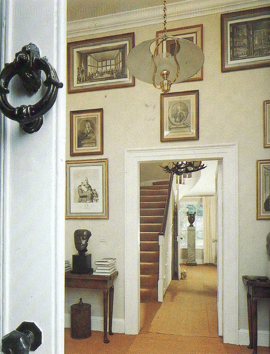
I often wondered what Roderick Cameron's house in Ireland was like - this "distinct failure"according to Billy Baldwin, though it is likely he meant the life lived in it rather than the house itself - but I could never find photographs until recently. Actually, I did not find them, they found me.

I've been corresponding with two people who worked for Roderick Cameron and very gratifying it has been, learning a little more about him - not the least for what I learned about double standards (not, I hasten to add, on the part of my correspondents). But more of that later...


Completely unexpectedly, there came an email from someone who'd commented anonymously here saying that she'd remembered seeing photos of Cameron's Paris apartment in an old magazine which, a couple of days later, having gone looking for it, she found in her library and was kind enough to scan and send to me.

I'll let her tell you:


"It's sychronicitous (is that a real word?), to say the least that I should have googled Menerbes and Les Quatres Sources more or less the same time you posted your blog. I hadn't done so for ages - but I was in France at the time (although in the Dordogne) so I suppose it was on my mind.

"... I seem to recall that there was also an article about Rory Cameron in a magazine called Connaissance des Arts, featuring his apartment in Paris - did you ever see that? He was also featured... under the heading, 'Who is the man with perfect taste?', mentioning his tablescapes and quoting the words of (the late) David Hicks, who was a guest at Les Quatre Source when I was there, with his wife, Lady Pamela. 

"At the time I was working there, I was really far too young to realize what an extraordinary place it was, which is why I didn't take many pictures. Of course, one didn't photograph things obsessively in those days, the way one does now, so maybe I wouldn't have anyway!" 

A few days later my out-of-the-blue correspondent added this:

"Hello - replying briefly in haste to tell you the astounding news that I have located the copy of Connaissance des Arts (Sept 1980), although it doesn't feature the Paris appt - don't know where I saw that - only Les Quatre Sources and RC's house in Ireland (Donegal). 


As I said, I have been corresponding with two people who worked for Roderick Cameron. Later this week  I shall post about what the second correspondent wrote. 

Friday, August 20, 2010

Just for the beauty of it


I spent part of a morning that began at 4am with a nightmare faculty meeting, sciatica and, after a flounce at the library sofa, Lutyens... continued about 5 with the Celt and coffee... a morning which, frankly, not involving one jot of intellectual activity, has been very agreeable, chatting about life, love, happiness and decorating, with friends, one of whom is on her last bout of chemo and is, thankfully, doing brilliantly well. I've watched a cloud form what looked like a funnel, wondered why one of the box trees, the Celt's pride, has gone the color of nicotine - actually, I know why and but I resist the idea (it's dead). Huffily, for a few minutes, I ignored the buzzer of the dryer - only towels, not shirts - and now, for the last time today, I sit down at the dining table looking at my MacBook and wondering what to write.

I'm surrounded by an accretion of stuff I've created since I got back - a magazine, a second computer retrieved from the boot of the car where it had thumped around for a month or three, a book about Lutyens (not the one I began the day with), a rolled-up Post-It note, a large white empty envelope and a clear plastic folder that neither of us, seemingly, know anything about. Luckily, there is room for the Manhattan I shall shortly make for myself - inoculation, you understand, for the second I shall have before dinner at our favorite Italian restaurant - a box containing a beautiful shirt, slim fit, all Egyptian cotton, made in Italy, of alternating blue and black stripes on a white ground. It will hang next to the blue and grey stripe on a white ground, non-iron, regular fit, all Egyptian cotton, made in Malaysia, French-cuffed shirt - and it will hang there the longer for being non-iron.

I have flirted with non-iron shirts over the last few years, and having watched favorite shirts (any shirt with or of blue is a favorite) rapidly deteriorate after a year and actually start fraying, ripping and shredding by the second year. The Celt's shirts, none of which are non-iron, all go to the laundry, mine go to the dryer and for a while come back out looking fabulously well-ironed.

Those days are over. You could say I have a bad case of brand loyalty - I shop at one men's outfitters almost exclusively. I hate shopping for clothes and until now have preferred the one-stop-buy-all routine I've followed for years - the man who sells me my shirts sold me my first when I moved here seventeen years ago. But if I am to stop wasting money, stop wasting resources, I must stop buying the non-iron shirts I elected to think such a boon for the last few years and, maybe more importantly, keep all the favorites, the beloved blue shirts, for a long time to come - just for the beauty of them.

Just for the beauty of it, photo by Paul Warhol, of the Madonna di San Biagio (1518) in Montepulciano by Antonio da Sangallo the Elder, to accompany text written by Dan Hofstader for Connoisseur, October 1990.

Monday, August 16, 2010

My man, wassup?

Wassup? 

Errm... ? is not the politest response to such a question but it does indicate how mystified I feel when I'm greeted in such a way. I have a similar response when asked who my favorite decorator is. I know its a way of beginning what the questioner hopes will be an interesting conversation, but every time I'm asked it stops me in my tracks. Do I just take a swig of my cocktail and forge ahead with a name, any name, or do I sedately discuss the idea that there cannot be one favorite?  In either case, eyes will glaze over and panic set in, and not necessarily on the part of the listener.


Who our favorite decorators are is a question we're all asked at some point in our careers. In my case, often, it is students who are looking for direction or even something to disparage - either is good, for it means a discussion can ensue. Limiting certainly, depending on the context, but it does concentrate the mind as to which decorators - and it has to be plural rather than singular - I think have had some real significance. Yes, I have favorites, but not quite in the way the questioner usually means: for those that I find to my taste, generally speaking, are long gone and not the usual names that get bandied about.


The weak point in any discussion of taste, which is really what is behind such a question, is personal predilection. Snares are many on the journey of taste from seventeenth century France, where it began, to today's romantic historicism. I'm promiscuous when it comes to style and I'm drawn to blue - from where I sit there is blue in various quantities around me - the sky (well, bits of it), the stripe lining a ladder-back Provençal kitchen chair, the kitchen cabinets themselves, the plumbago on the terrace, the tulip vase by my left hand, the silk at the windows, an armchair in the living room... even a dog in a garden below, blue in the face, no doubt, from the yapping it has been doing for the last hour - and because my predilection is so strong I have to be wary. It is, after all, just my taste. But not all that is blue is to my taste.


In matters of taste, designers are often accused of being original which is a pretty sobering accusation - one that can lead to tweeting between the Fates and the Furies, and in the rarest of cases, hubris. In reality original as a concept is pretty nebulous, if not downright bearing of false witness. And in contemporary use, original in its simplest just means recast and at its most rare, transfigured

With today's designer, Arthur E Smith, taste and transfiguration are happy companions. Thirty years ago, when I first saw this house, Smith's own on Long Island, it was I who was transfigured, with this man's taste. Smith, definitely a favorite of mine - one of the band of designers who took over when the old guard such as Billy Baldwin retired - is not unknown today, but the longer the remove between the end of his career and the careers of those practicing today, the greater the danger he and his like fade from memory.  


All that serious stuff aside, isn't this dining room delicious? Delicious, certainly, but original? Who cares? The room, as are the other rooms, is a superbly beautiful, urbane, comfortable, classic and as bang up-to-date as it was when published in 1989. Originality has nothing to do with it - but taste has everything to do with it.


Photos by Peter Vitale to accompany text of an interview with Arthur E Smith, written by Patricia Warner for Architectural Digest and published in July 1989.


Friday, August 13, 2010

Ça va?

I wish I could say that I had a special place to write though in a sense where I write - the dining room - is special and being what it is it, it certainly cannot be dedicated to writing. It's not that we use the dining table daily for we have a table, banquette and chair in the kitchen for ourselves. The hall closet is big enough to use as an office but its present incarnation as a purgatory of objects too valuable to be rid of - a crumbling green chinoiserie console, a writing table with a trompe l'oeil top from Provence, a vacuum cleaner, a severed head, the maid's mops and rags .... well, you get the picture.

Today's post is not really a gripe about not having a place to write, though gripe I could given that my papers, scanner, books, photocopies, notes, swatches, plate with two hot dogs and a tumbler of red wine, have reduced me to using a corner of a table big enough to seat eight, but actually about a former gardener's cottage. Le Petite Clos, on the grounds of the Villa Fiorentina is a house where, for a time, Roderick Cameron lived and wrote some of his books - books such as Viceroyalites of the West: The Spanish Empire in Latin America, that I have yet to read.


Other people's desks, like their bookshelves, are alluring, and Roderick Cameron's is no different. It's clearly a worktable with space to write, dictionaries, thesaurus and other reference books are to hand, as are charts and maps, and many a beautiful object to caress with eye or hand in those moments when the muse calls the mind inwards: a passion flower from the garden, a bowl chrysanthemums, a pair of ivory cups, a lacquer pencil holder, a box of Kleenex, a pocket watch, a travel alarm clock and, apparently, pieces of eight, though whether they are those objects, not terribly coin-like, to the left of what looks like a closed fan or letter-opener, or perhaps they lie out of view in the silver-mounted human skull.

I don't know why I was surprised not to see a typewriter for many of that generation preferred to write and enjoyed the physical act of writing, correcting, and rewriting. And what a chore writing has become. Beyond the occasional Thank You note who of us actually writes with pen on paper? The pen has gone form being mightier than a sword to being an object that leaks in the kitchen drawer. I would not, could not, live without my computer - I type, I read, I blog, therefore I am.

I learned to write with a "dip-in" pen, basically a stick of wood to which a metal nib could be inserted into a ferrule at one end, and which was dipped into an inkwell in the school desk. The day I progressed to joined-up letters was a real right of passage, as important as going into long pants, though one did not even know that phrase existed then. It just meant more washing out of ink stains from shorts and shirts and a permanent blue stain at the side of a finger replaced pretty quickly by nicotine on fingers other than mine. I remember being given a fountain pen, a special occasion and a big expense, and the pride with which I performed my first really grown up task - buying a bottle of blue ink. Blue ink was for school and black ink for .... well, more important things though quite what they might have been all those years ago is hard to say.

The smell of school ink remains with me and reappears when I drink certain, usually expensive, red wines. It's a truism to say that smell can instantly unlock memories long put away and wine can do that for me if I taste ink. What for the wine buff is the subject of an hour or two's conversation, is for me the awakening of memories that are vivid - dour gothic architecture, slate roofs, rows of wooden desks with lids and inkwells, leather satchels for books and pencil cases which were exchanged for briefcases when one reached fifteen or so, royal blue blazers with badges, school assemblies, being caned by the vicar for forgetting my bible, a print of The Creation of Adam hanging embarrassingly and fascinatingly in the boys' cloakroom, singing patriotic songs on Empire Day ... some talk of Alexander, and some of Hercules, of Hector and Lysander, and such great names as these .... worrying I would end up down't pit or in't sheds, taking the bus to Manchester to look at my beloved Pre-Raphaelites, learning to be embarrassed by my accent, wondering, wondering, wondering if I was the only one .... times that should have long been forgotten, but lurk behind many a wine label.

That flavor that I call ink has been explained as oak but I don't believe it for something had to be done with all that ink after fountain pens acquired cartridges, and the ballpoint pen, courtesy Mr Bic, was invented.


The whitewashed living room in which the writing table stands is elegantly furnished with a blue-and-white upholstered American sofa from 1840, eighteenth-century engravings of ducks, original engravings showing Captain Cook's third Pacific voyage, a red lacquer Regency chair next to a starched white linen skirted table, and a tiny turntable on a stool near the window seat standing next to the open doors to a covered terrace where, on the wall, hangs a tapa cloth brought back from Tonga.


The glory of this small house is not the furnishings and decoration, personal and restrained though they are, but the tropical garden, a gardener's setting for a gardener's cottage, that Roderick Cameron filled with plants - souvenirs, like the tapa cloth on the terrace and mats on the dining table, of journeys made and people met.


It is likely I will remain by the Mediterranean for a while longer but with occasional trips back to the United States.


The title, Ça va? Apparently Mr Cameron had a parrot that greeted guests with that phrase.


Photographs by Marc Lavrillier and texts from which my notes were taken were originally published in L'Oeil: The International Art Review. These photos are from European Decoration edited by George and Rosamond Bernier, published by Reynal & Co in association with William Morrow & Co. No date of publication is given and neither are any there attributions for authorship of articles.

Tuesday, August 10, 2010

The problem with blogging ...

... is that it could, if one were not careful, get in the way of earning a living. In its own way, blogging is a scholarly activity, whether by dilettantes or acknowledged scholars:  a bookish pursuit. I'm lucky to have my own library and the use of a university library – where, frankly, the interior design content is nowhere near as good as my own, but which does boast a collection of Architectural Digest going back to the late 1970s. All bound in half-yearly increments but alas with many a page, sometimes whole articles, missing.


The 1970s and 1980s are proving to have been such fertile decades for interior design. Many of the decorators and designers who died young, often of AIDS, in those years, I have already written about, and one of the most moving aspects of my research is noticing how their names no longer and with no marker of their passing, simply disappear from tables of content. Luckily, those men were prolific in their output, ranged in terms of creativity from the gentle to the sassy, and were published often.


Here I want to pay tribute to the woman who guided Architectural Digest from a rather stuffy West Coast magazine to an internationally recognized phenomenon. Over the last few years, the magazine began to feel rather desperate, relying almost on celebrity rather than aesthetics - really low points recently being Gerard Butler's and Michael Jackson's houses. In a way, of course, this was no different from what the magazine showed in the past - many a celebrity, movie star, politician or television personality got decorated and published, and frankly their interiors were dire and it did not matter. So if nothing has changed, what happened? The magazine and its editor may not have changed, but the world changed around them – and suddenly a long- and much-respected magazine had lost relevancy and it was as if they did not notice.


Much has been written in the bloggersphere about Paige Rense and in recent years less than flattering. And in a highly visible job such as Editor-in-Chief of a prestigious publication public criticism comes as an occupational hazard. It would be all to easy for me to jump on that bandwagon but I've had some time this week to reflect. And on reflection I think she's done a remarkable job especially when one considers Ms Rense has done it for thirty-five years.

My tribute, then, to AD's Editor-in-Chief, Paige Rense Noland, is prompted by my overview of her magazine's contribution to the history of twentieth-century interior design. To sit at a library table, day after day, looking through past issues of the magazine has led me to the conclusion that here was a majestic sweep of frequently original, often exciting, persistently traditional (and occasionally pretty bloody awful) interior design, as defined by one personality.


Thus, back to my theme: that group of acquaintance that included Billy Baldwin, Roderick Cameron and Arthur Smith, Van Day Truex, and Hardy Amies, remains a subject of fascination to me. It's clear Arthur E Smith was one of the best decorators of the twentieth-century: assistant, business partner, successor to – but in no way imitator of – Billy Baldwin.


Today's post, a pavilion overlooking the Mediterranean, designed by architect Tom Wilson, decorated by Smith, and belonging to "an American couple who own one of the most beautiful properties in the south of France" is perhaps the most Baldwin-like of all: beautifully restrained, tailored and agreeable.


The owners are not named, but their identity may be guessed-at. This pavilion, Palladian in style, overlooks their infinity-edged pool, one of the few true ones, that visually ends in the waters of the Mediterranean.

A dream of a setting, worthy of that synthesis between a great magazine and a great designer.

Photos by Peter Vitale to accompany text written by Valentine Lawford for Architectural Digest, April 1979.

Friday, August 6, 2010

My first bathroom

The fourth in an occasional series about necessary houses, bogs, WCs, comfort stations, garderobes, heads, johns, ladies' rooms, latrines, lavatories, outhouses, potties, powder rooms, cloakrooms, restrooms, thrones, washrooms, and bathrooms.


Occasionally one hears of bathrooms being described as retreats or sanctuaries, as they may well be for many people. Such descriptions suggest a room spacious enough to include a bathtub larger than the white enameled puddle that is standard in many a bathroom across this land.

I was raised in a house with a bathroom that had the usual appointments for the time - a capacious, claw-footed cast iron tub, a high tank, pull chain toilet pot and a white stoneware sink with chrome taps, no shower and no heating, the only ventilation being an open window. Lighting was an unshaded bulb hanging overhead. Times change, but what the experience of my childhood bathroom has left me with, besides a dislike of unheated bathrooms, with walls running with condensation, is a desire for the (relative) austere and forthright ablution.

In the 1970s, in a mild fit of DIY, I bought some brightly colored wallpaper, an orange plastic bogroll holder to match, peach gloss for the door, and a kerosene heater. I'd had enough of the damned, damp, marrow-sapping chill that very closely matched the dour climate of Lancashire.

There were two coal-burning fireplaces in that house - one in the living room and one, in its never-used-black-leaded purity, in my grandparents bedroom. A situation unimaginable to many in this day and age - the only heating came from one coal fire. The rest of the house went without heat.

Hot water, of which there was plenty in winter, came from a tank that sat behind the back wall of the fireplace. This arrangement had two disadvantages. First, a lot of hot water had to be drained when the thunderous noise made by boiling water came from the fireplace; second, in winter, if the fire was not banked overnight, the water in the tank froze – only to burst when a fire was lit. One advantage was that the hot water storage tank was kept in a closet in my grandparents' bedroom and, being uninsulated, warmed the closet, actually called the "airing cupboard," the place to let newly ironed linens "air" - that is, dry off completely.

Luckily for me, my grandmother loved to wash and iron, and there was plenty of hot water for washing.  Water from the kitchen tap was transferred by bucket to the washing machine, if machine is what one could call it. The first washing machine I ever saw my grandmother use – and if my memory serves me right it was the first she ever owned – was basically a copper kettle, heated by a gas ring underneath, with a lid incorporating a hand-turned agitator, a wringer for squeezing out the water, and a tap low down for draining the water into the bucket that had filled it. My grandmother kept that washer for years.

What I didn't realize then was that I was watching a method of washing that was pure nineteenth-century – if not earlier. It is not easy to imagine nowadays, but washday could last effectively all week, especially if the household was large. My grandmother's washday was Monday, the traditional day for beginning the wash, and seemed to take a whole day. First, as I say, the copper was filled, clothes washed and wrung, the copper emptied of suds, clean water put in at least twice for rinsing, then filled a third time for "bluing" the whites. All went to hang in the garden on a clothes line that always had to be wiped clean of soot (these were the days before any clean-air legislation) before anything was hung. Freezing weather did not diminish the need for washing and hanging out - I remember being charmed by my grandfather's shirt being so stiff from the cold I could hold it in front of me like a board.

Ironing, before she bought an electric iron in the 1960s, was with one made of iron, heated on the stove, tested with a wet finger and – though I don't know why – smoothed on a bar of soap.

As I say, times change, for many years later the Celt and I have a Miele automatic, front-loading washing machine and dryer (still in the kitchen, but that is a story for another day.) Ironing? We both can iron a shirt better than any laundry and even sheets and pillowcases have been known to be dashed with a smoothing iron.

Oh yes... back to the bathroom. I don't need my bathroom to be a sanctuary, retreat or gallery for family photos. What I need is functional, clean and handsome: good light to shave by, a powerful shower, a warm-when-needed floor, and good fresh towels. Pots, potions and other talismans against the evil eye of aging, out of sight in drawers, towels stacked on shelves and other surfaces clear as can be. Get in, get done, get out, get on with the day.

Clean and handsome in our case means travertine floor, largish shower, frameless glass shower doors, Venetian plaster walls that live well with travertine and are sympathetic to early-morning skin, a simple large mirror, two plain sconces and a really big, framed 1970s poster by Rene Gruau advertising Dior's Au Sauvage. Oh, and no tub!


Photo of Charles de Beistegui's bathroom at the Villa Labia, Venice, by Gianni Berengo-Gardin for an essay published in The World of Interiors, April 1987.

Monday, August 2, 2010

Authenticity

A few days ago in a post based on a comment I made to Mr Victoria and to some extent lamenting the lack of discrimination in modern design, I used phrases such as "inspired by...," "in the manner of... " and "an homage to..." which to me are all euphemisms for that well-known to-the-trade-over-a-drink phrase – not that anyone would impolitic enough to tell the emperor he's nekkid – "knock-off." I concluded by saying that authenticity is almost as slippery a notion as chic, and to my mind all the more interesting in a society where furniture designs cannot be copyrighted.

Friday was a reading day – beginning about six-ish with The Private World of Yves Saint Laurent  & Pierre Bergé, Elizabethan Architecture, and Mark Hampton: American Decorator. Van Day Truex and I landed together on the library sofa sometime in the afternoon.  


In Van Day Truex: The Man Who Defined Twentieth-Century Taste and Style it is mentioned that Truex had written an article about Jean-Michel Frank for Architectural Digest in 1976. I remembered that amongst my stack there were some issues, two in the event, that had essays by Truex but neither turned out to be the one I was looking for. What I did find was an essay Van Day Truex on Design subtitled Reproduction Furniture: The Pros and Cons - an essay definitely grist to my mill.


"There is no question that those of us who are interested in our own times in design prefer the contemporary solutions. We usually prefer to possess a contemporary design and, if we select from the past, we prefer the original, not the reproduction.

"There are certain situations that justify reproduction. I quote William Gaylord in Architectural Digest, May/June 1977, concerning the four Louis XVI armchairs in the living room of his San Francisco apartment: 'The only reason I have Louis XVI armchairs is that I have never sat in a chair more comfortable.' He possessed two signed original examples and he has expertly reproduced two more to fill the need of a dominating group of four in his eclectic apartment. I wish he had added to his reasons: 'and because they are subtly designed, so excellent in their restrained use of moldings and other architectural motifs.' In other words, so successful in function, form and embellishment."

Van Day Truex also mentions a David Adler house the dining room that contained eleven reproductions of one original Chippendale chair and that for him, "The original possessed such bold style and comfort, I did not question the urge to reproduce, because the reproductions gave a strong rhythmic emphasis to the room."

Further, he opines, "I wonder if our dislike of a copy in furniture, when we cannot possess the original, stems from the sorry state of too much reproducing and too many inferior examples - a choice not determined by a designer's eye but one that is mainly and plainly promotional in character."

"I would like to see a list of furniture designs from the earliest production to the present moment, selected by a top-ranking designer - the choice determined by a highly sensitive objective eye choosing models of lasting, timeless merit. Herein would appear examples that are purely functional, such as an Egyptian folding X-stool, an early Chinese console, simple chairs and tables from the eighteenth-century - excellent in proportion and function, with the minimum of superficial decoration; certain Shaker designs, some Thonet models. There has been too little production of such expertly selected examples and far too much of badly selected designs."

Towards the end of his essay, Truex asks why we should be deprived of good furniture design from the past just because we can't have the original. "We use beautiful Edwardian chintz patterns, we continue to enjoy Morris wallpapers, we copy from primitive African fabric patterns."

He continues with what I think the most interesting thought of all in light of the growth of interior design marketing since the 1980s: "As furniture becomes more edited, as we use more built-in storage space and more upholstered pieces, we are eliminating more and more unnecessary furniture. This means there is all the more need for the remainder to be well-designed. The criterion should really be quality of design."

Perhaps one aspect of design that Truex did not foresee was the alliance between manufacturing, marketing, morality and mindset - the you deserve it approach, for example. That he foresaw modern America "eliminating more and more unnecessary furniture" is of the greatest irony – for nowhere in contemporary design is that to be seen, either in fact or as an idea for discussion.

On reading Truex's very polite biography, it becomes clear his aesthetic and by extension that of his friends, Billy Baldwin and Roderick Cameron, is as straightforward as his food and clothing – the one simple, fresh and moderate, served on restrained, but not necessarily undecorated, china; the second lucid, elegant and well-tailored. To put it another way, there should be neither physical gluttony nor aesthetic greed. Somewhere along the line, the phrase the elegance of refusal has become attached to my memory. It is a concept with which we no doubt all would agree – provided we do not have to practice it.

I'm not writing a polemic here, but surely to discriminate is to have learned, to have trained not only the eye but also the wallet; to have understood basic principles of proportion, space and even time. To chose is to not uncritically accept brand as signifier of quality. To distinguish is to think. To think, to know, to discern, to be critical, is to be educated. I do not believe in innate taste; however, I do think a predilection for exercising critical faculties is both innate and something that can be enhanced by practice and training. Education is all.

So what is authenticity? If a chair is made using the same methods and materials as its antique prototype, is it any less authentic for being a copy? Of course, pedigree plays an important role, especially when one draws near to the border between authentic and counterfeit. In that word authentic lies a whole world of assurance of quality yet I wonder if that very assurance is in itself a mere counterfeit.


Quotations from an essay entitled Van Day Truex on Design, subtitled Reproduction Furniture: The Pros and Cons published in Architectural Digest October 1977.


Photo by Russell MacMasters from Architectural Digest, May/June 1977.


Van Day Truex: The Man Who Defined Twentieth-Century Taste and Style, Adam Lewis, Viking Studio, Penguin Group 2001.