Tuesday, October 28, 2014

Rustic Chic


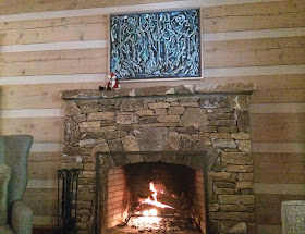
We spent part of the weekend in Highlands NC, at our friends' cabin. A simple, rustic place it is not; architecturally, it might resemble the log cabins the Finns introduced to America but the kinship isn't close. Wise enough to leave the structure as they found it, and knowing only too well the so-called mountain style available locally, our friends employed a young Atlanta designer, Niki Papadopoulos, to furnish and decorate the place. No easy job, I think, given client's requirements, budget, and the physical limitations of a two-story cabin (placement of doors, hallways, etc., ) but it is a successful one. There's nothing even faintly resembling an "Orkney" chair or any other form of rusticity (one exception is a belated housewarming gift of a fox doll given by a friend which perches on the fireplace against the frame of a beloved painting by the late mother of one of the owners), and certainly nothing that indicates any understanding of straw (see below). 


One of life's pleasures, and one so easily forgotten when one lives in a high-rise, is a Saturday morning on the sofa reading in front of a fire. My friend David had the Sotheby's catalogue of Mrs Paul Mellon's Jewels and Objects of Vertu which for him, as a jewelry designer and certified gemologist, is of great interest. I find objects of vertu endlessly fascinating though I am not given to whole troves of them spread out over our table tops, but two of Mrs Mellon's caught my eye. One, the tri-color gold box resembling overlapping oak leaves by Verdura and the second, a gold, gem-set and enamel table ornament in the form of a pomegranate, also by Verdura. I could clear a surface or two for those.


Mrs Paul Mellon, repeatedly, whilst alive and despite an indomitable guarding of her privacy, was epitomized as a nonpareil of taste and, now that we can see some of her interiors, she seems to have enjoyed large pleasant, conventional and discrete rooms – so ordinary unstudied, in fact, some people are hard-pressed to find anything spectacular about them and are reduced to making quite silly statements about her. Before you read the following from Miles Redd, let me say I have nothing against understanding straw, settees, (even when pronounced settays), "Orkney" chairs or, even, Mr Redd.

"Someone very grand  once told me that it takes a lot of style to understand straw, and I do believe Mrs Mellon almost invented that notion. To be able to see the rustic chic in an Orkney chair and then walk to the other side of the street and appreciate the refined curves of the gilt and chalk Settee takes a special eye, and she had it."

The Orkney chair – given its present-day form in the late nineteenth-century. The original developed in circumstances in which these modern-day extollers of "rustic chic' would be horrified to find themselves. 


In conclusion: who would not wish to have had time in Mrs Mellon's library, browsing her books and, taking advantage of her hospitality, read at leisure as fancy struck. I, for one, would have loved it.


Sotheby's Auction Lot 930 A Scottish Pine and Rushwork 'Orkney' Chair
Estimate $200 - 250

Sotheby's Auction Lot 42 An 18 Karat Tri-Color Gold and Colored Diamond Box, Verdura
Estimate $15,000 - 20,000

Sotheby's Auction Lot 39 A Gold Gem-set and Enamel Table Ornament, Verdura
Estimate $10,000 - 15,000


Photographs of Mrs Mellon's tricolor gold box, pomegranate table ornament, and books from the catalogue.

Monday, October 20, 2014

Running on Low

I apologize for being tardy in replying to your comments on the last post. Strangely enough after my week away in New York, Philadelphia and Washington DC I am running on low. I should be back by the end of the week. 

Running Satyr Boy Holding an Owl
Claude Michel known as Clodion


Of all the splendors of the Philadelphia Museum of Art it was the minor grace of Clodion's Running Satyr Boy Holding an Owl that caught me.

Friday, October 10, 2014

Times Past and Times Present

Does anyone remember a world without hostess gifts? Am I the only one who objects to taking along a bottle of wine every time I step out of the door for dinner at a friend's house? Is any one of us nowadays unused to a nibble with a cocktail? I remember when the, to me abominable, habit of taking along a bottle of wine began, and I was as sure then as I am now that it was a result of salesmanship aimed at the genteel classes – people anxiously persuaded that the path to Salvation meanders through the countries of Graciousness, Fine Chinah and Regifting. Apropos cocktail nibbles I came across the following whilst reading Michael Innes's A Connoisseur's Case. Times change, indeed. 

“But, Uncle Julius, wasn’t it only rather earlier that people were transported for poaching?’
‘Was it? The more’s the pity.’ Colonel Raven put down the decanter, picked up a plate of small cocktail biscuits which had been set on the tray beside it, carried these over to the hearth, and there emptied them into the low fire burning in it. ‘My people are all dunderheads,’ he said. ‘Impossible to get them out of these damned vulgar habits. Got hold of them in London hotels, I suppose. What did you say, my dear?” [The italics are mine.]

Porter's chair, allegedly from the Bank of England Museum

From another of Innes's tales, again with the same hero, John Appleby, a quotation about changing times but only obliquely so – about a perfectly functional piece of furniture that, for some, has travelled up the social ladder and changed sex, whilst, for others, it should have remained where and what it was.

"And Appleby grabbed Judith by the wrist and hauled her within one of those curious contrivances, midway between a sentry-box and a family sarcophagus, which the eighteenth-century considerately provided for the porters in its draughty halls." [Again, my italics.]

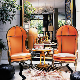
BG Restaurant, Berdorf Goodman
Photograph Bergdorf Goodman

I first saw the modern, more fashionable version that is used, for example, in the Kelly Wearstler-designed BG Restaurant at Bergdorf Goodman, forty years ago in Harrods and still I loathe its ill-proportioned conceit. The Horrids version, if I remember rightly, came from Italy and was to be found in its Decorative Furniture department. I've seen it in "antique" leather, in linen, in velvet, buttoned and not, and in wicker. But what I haven't seen, though it must have existed, is one with a liftable seat above a chamber pot – the cause of much tittering and blushing in the shires cul-de-sacs of this land if a chamber pot were even to be recognized for what it is.

I make no comment on Ms Wearstler's version except to say I have never sat in one on any of the occasions I have eaten at BG. The following quotation from One King's Lane may give some hint as to why.

"The Fabulous Porter Chair"
Photograph from One King's Lane

"These dramatic high-backed chairs are most recognized as the seats of power for ladies who lunch at the Wearstler-designed restaurant BG in New York’s Bergdorf Goodman department store. Irresistibly feminine, the canopied chairs are a Marie Antoinette dream come true."


Speaking of ladies who lunch, the last time we were in BG, we sat next to two young women speaking English and French interchangeably, in that easy way that only people with absolute fluency in both languages can – one, it transpired, the Executive Vice President of Laurent-Perrier U.S., the other the Direction de la Communication et des Relations Publiques in France. We had extended cross-table chats and much Laurent-Perrier champagne; so much so, we were only capable of an afternoon nap rather than our planned quick canter around the Jeff Koons retrospective at the Whitney (which, it occurs to me now, might well have benefited from the Laurent-P we'd imbibed). A few weeks later, from one of those ladies at lunch, arrived this lovely and very useful champagne bucket, together with a set of flutes. A delightful and very generous gift that has been the object of none too-subtle hints by would-be regiftees!


This morning we leave for New York – friends from my university days are visiting this country for the first time. and we are joining them for a few days of museums, opera, cocktails (with nibbles), lunches (at BG, Jean-Georges, etc) and the postponed visit to the Jeff Koons retrospective (described by my brother-in-law, as the high-fructose corn syrup of modern art). Thereafter we're driving to Philadelphia and thence to Washington DC and I hope to be blogging whilst I'm away. 

Monday, October 6, 2014

The Interiors of Chester Jones, a recommendation


"It is neither realistic nor desirable to see homes in terms of antique or modern, classical or rationalist. For one thing, in this age of eclecticism there are so any styles. Is it right, with regard to the design of interiors, to believe that only one style is valid, given the proliferation of architectural and fine-art theories? The only judgement that is valid is to avoid the strict historicism in which every effort goes into the recreation of a single moment in time past. It is disheartening, for example, to see people awkwardly occupying Louis XVI-style rooms, accessorized to the last period detail, in a New York apartment of completely inappropriate proportions, but it happens. Likewise, the taste for English eighteenth-century-style rooms, often with very good furniture – in new houses is still prevalent. It is just as disappointing to see apartments fitted out with mid-twentieth-century furniture, fittings and artifacts designed by Jean ProuvĂ© and Charlotte Perriand, along with light fittings and accessories by the best designers of the day. Driven by nostalgia, this is little more than the same problem but with focus on the twentieth century. The impulse to assemble the contents of rooms within a narrow historical tradition continues. However, such an emphasis on a limited range of ideas, as brilliant as they might be, sits uncomfortably with today's interest in personal, idiosyncratic expression.

"This is not to suggest that eighteenth-century fauteuils, English Georgian furniture or even the great modernist pieces should not be used; they obviously should, and should be enjoyed. It is rather that the various pieces are better used as a counterpoint in an interior, or to perform a function, rather than to conform to the static programme of some period tableau."


Until Friday afternoon when I walked into Barnes and Noble I had not known of this book's publication. Of all that was on offer, this book was the only one of interest to me. I have written about Chester Jones before (see side bar Labels) and he belongs in my own pantheon of erudite designers. 

The first paragraph of this post, a quotation from the book, introduces the man and his work very well, I think. The book, simply entitled, The Interiors of Chester Jones, gives beautiful examples of his interiors, furniture designs, design philosophy and his method of working. Hitherto, his interiors were only seen in the pages of The World of Interiors and I am very thankful to have an expanded and thorough collection of Mr Jones's work to hand. I cannot recommend it more highly. 

Chester Jones's own sketch for a table inspired by Vladimir Tatlin's Monument to the Third International 1919 (below from Wikipedia Commons. See photograph above by Andreas von Einsiedel from an article written by Chester Jones, The World of Interiors, December 1995)


Photograph by Fritz von der Schulenberg, from The World of Interiors, October 2005.


 Hand-drawn floorplan and elevation from The Interiors of Chester Jones 
The type of illustration that illumines the process of interior design 
and gives life to the design of a book and to the reading of it


Nota Bene: I received nothing for this recommendation except the enjoyment of making it.